Organize the World
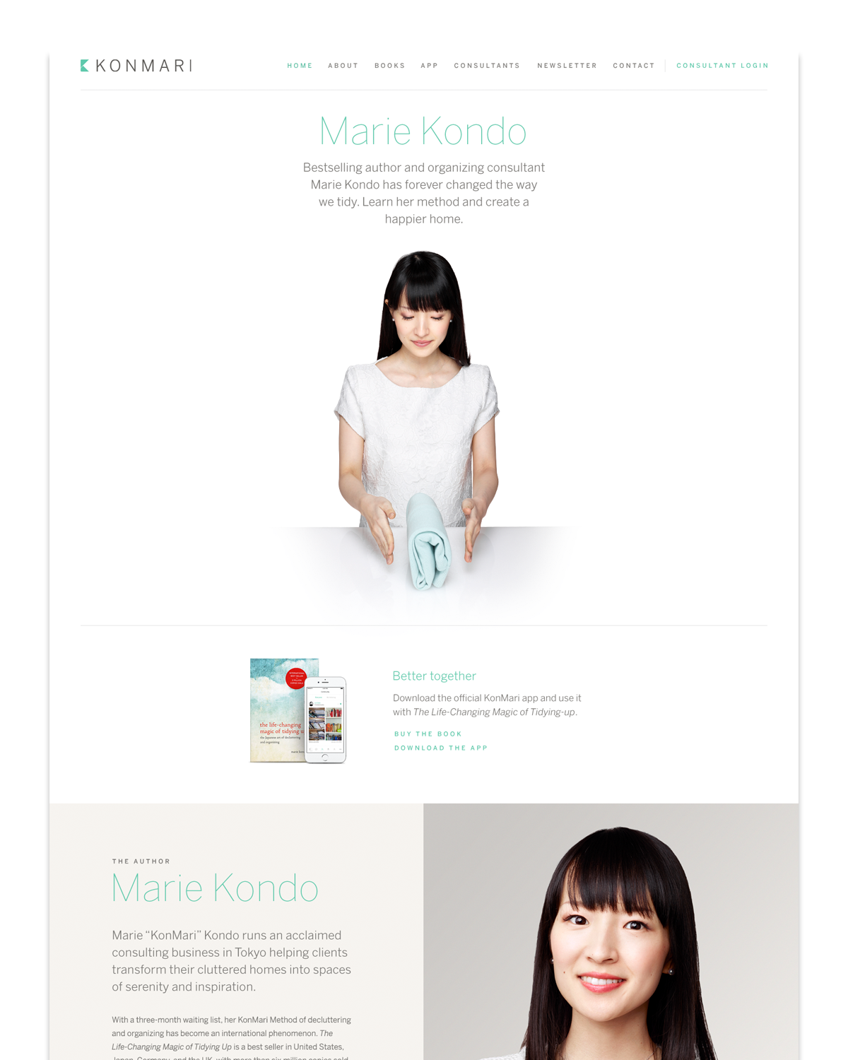
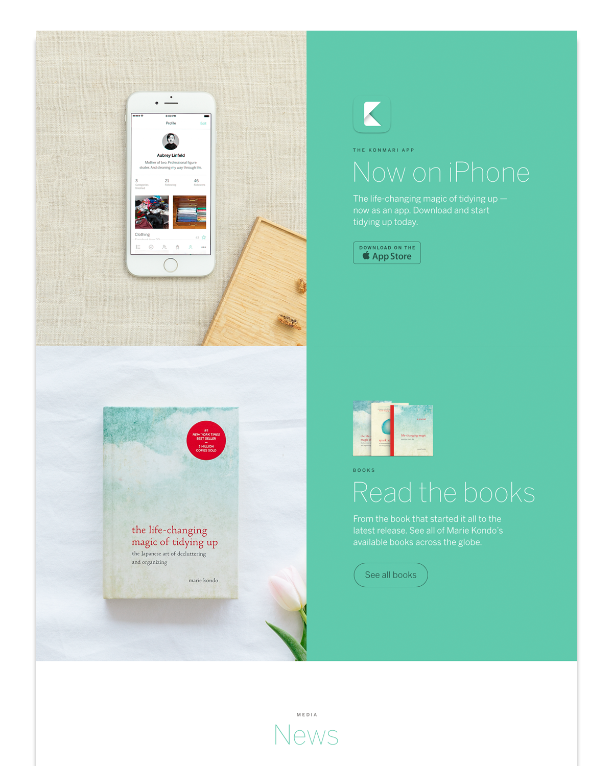
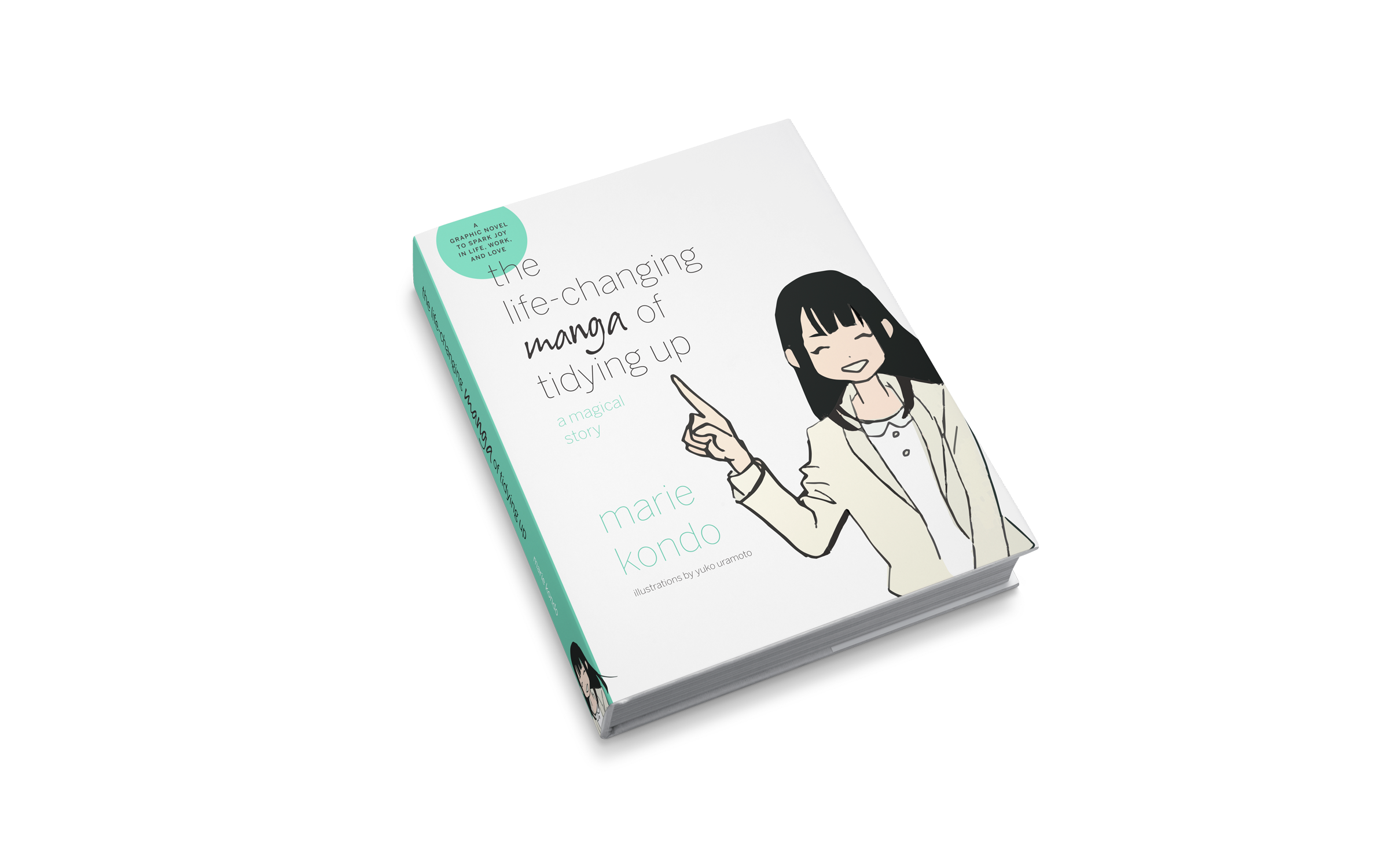
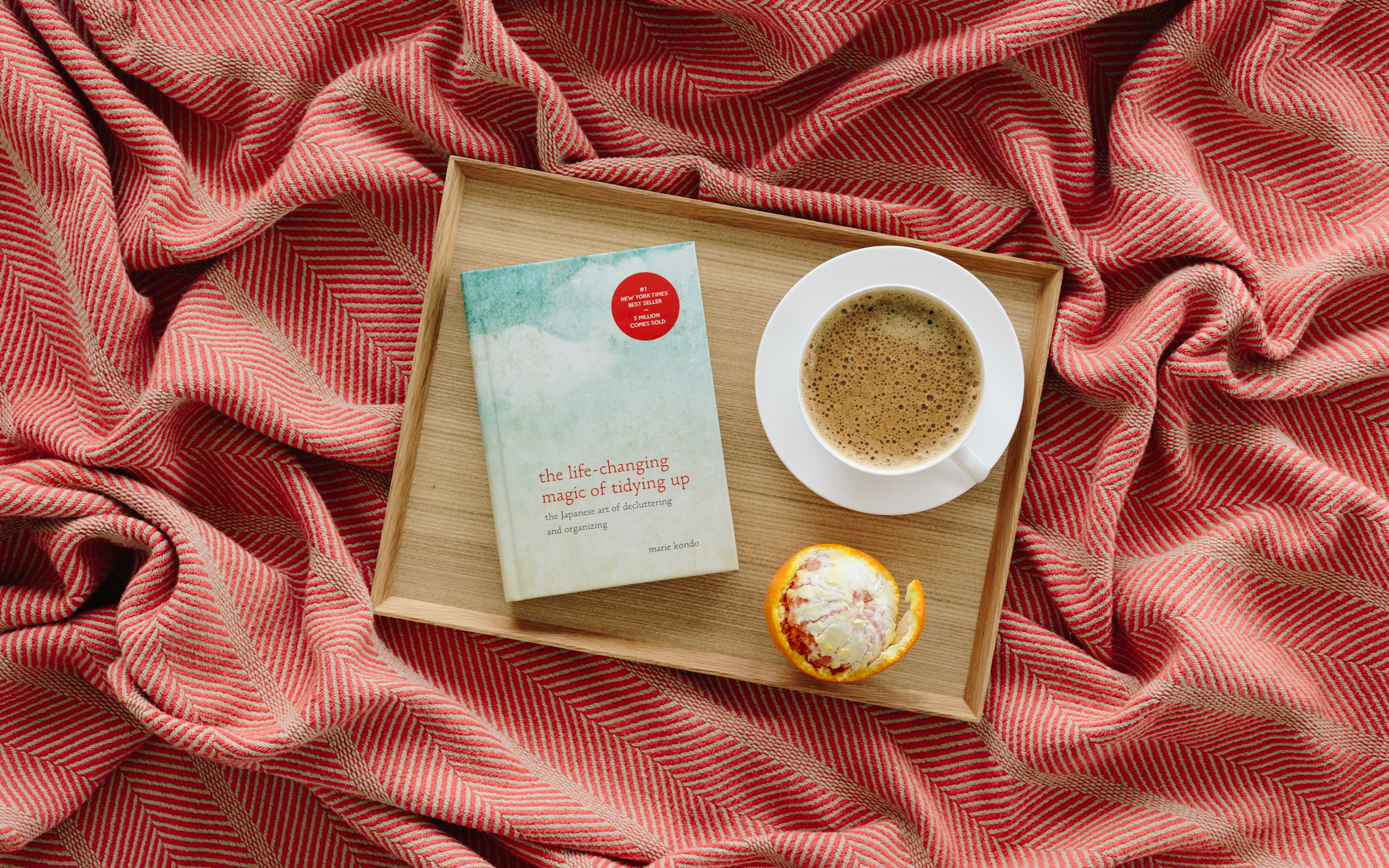
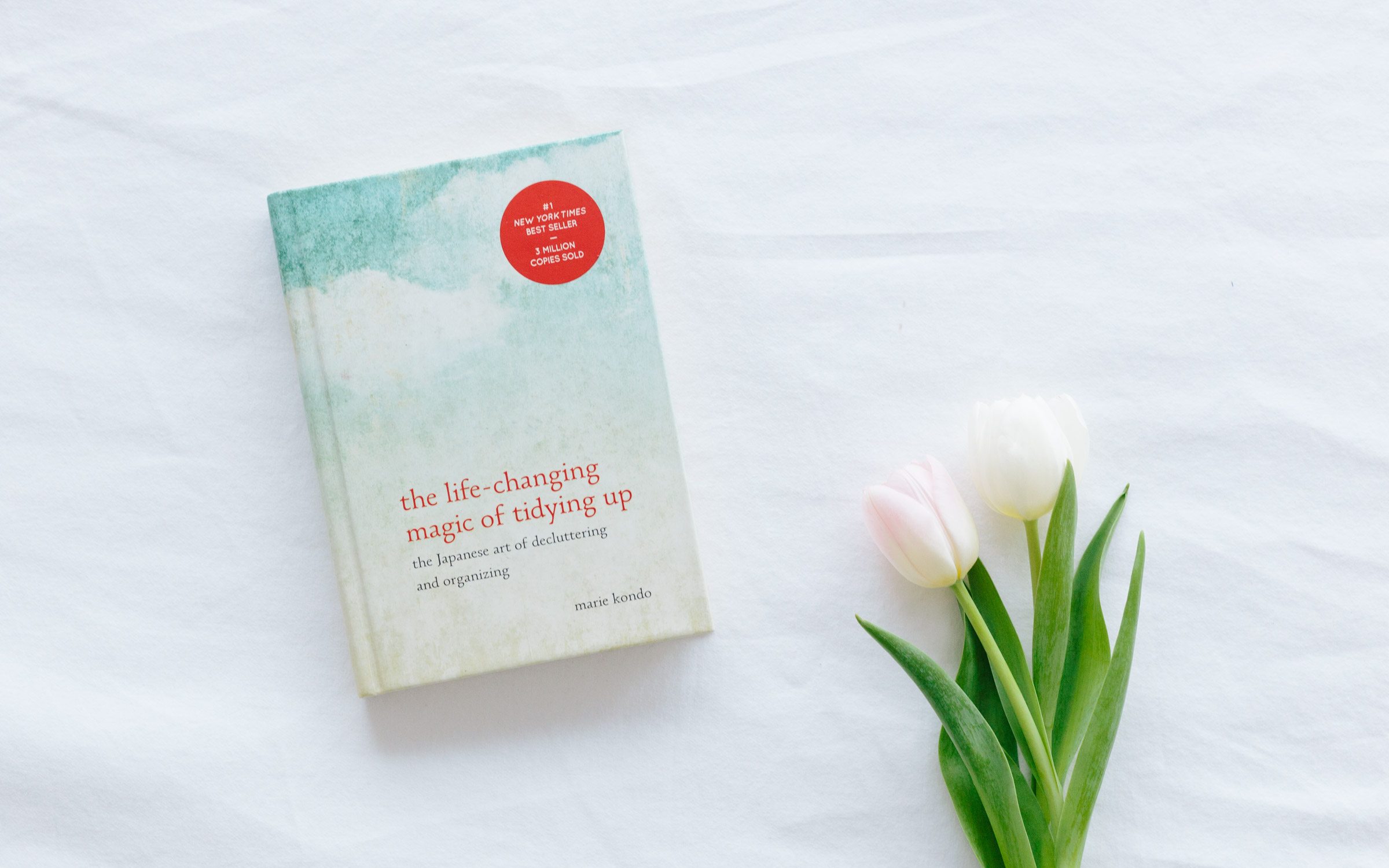
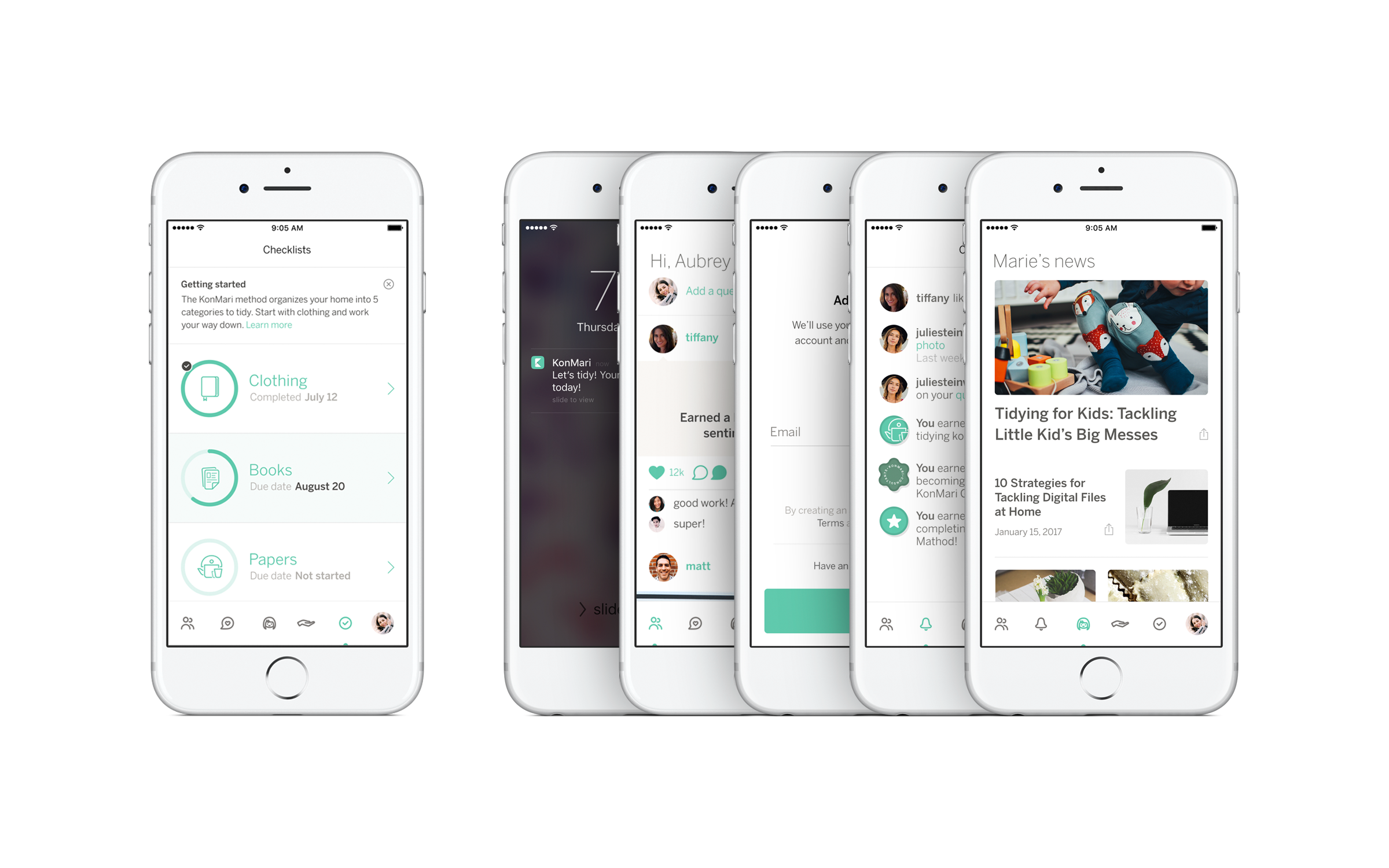
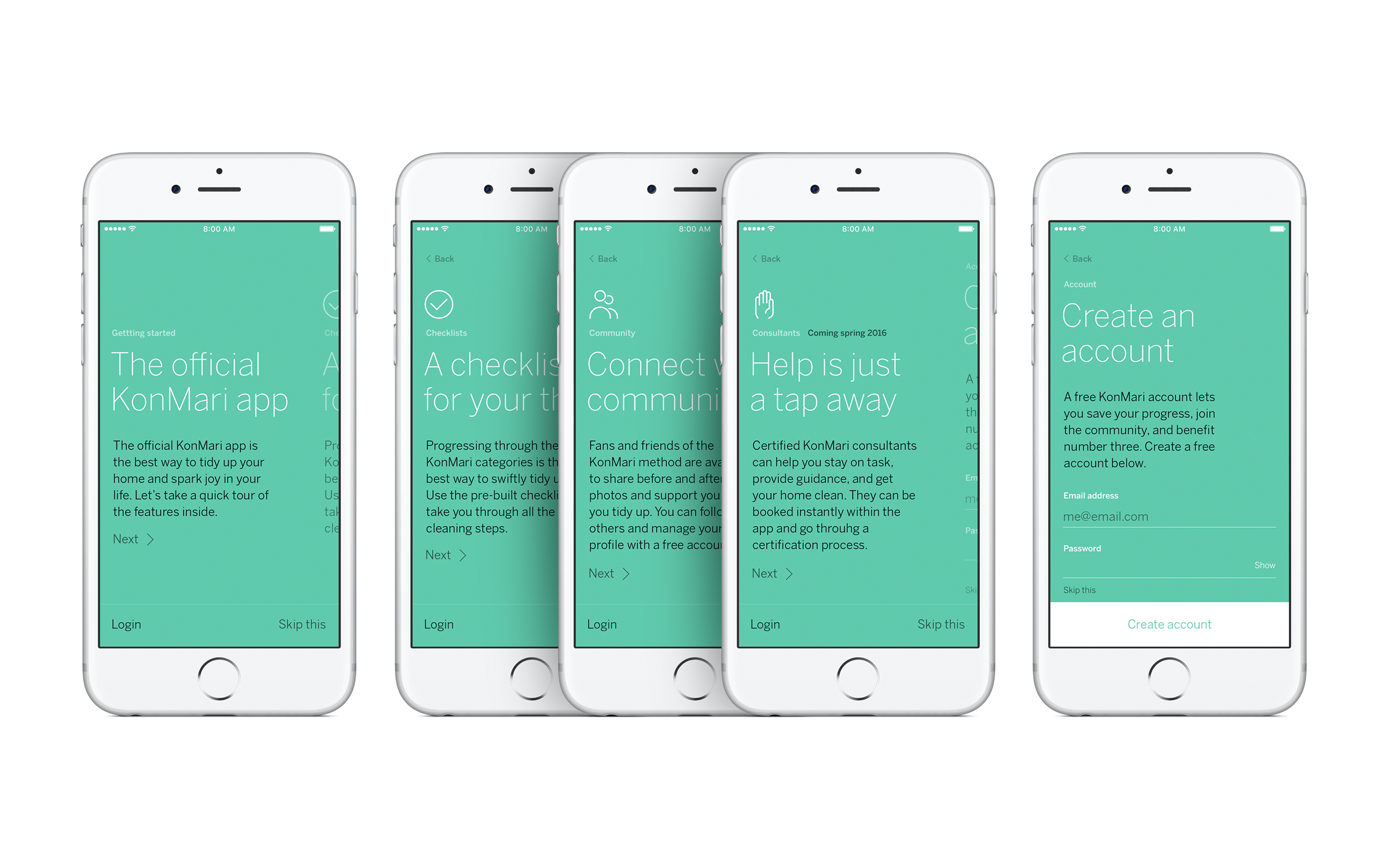
KonMari Media is the business extension of Marie Kondo’s organizing phenomenon, The Life Changing Magic of Tidying-up. As their first designer, I handled the entire brand experience from digital to print: logo, photography, web, iOS, book covers, clothing, product design, and everything in between. The brand has since then grown into a new look and feel.


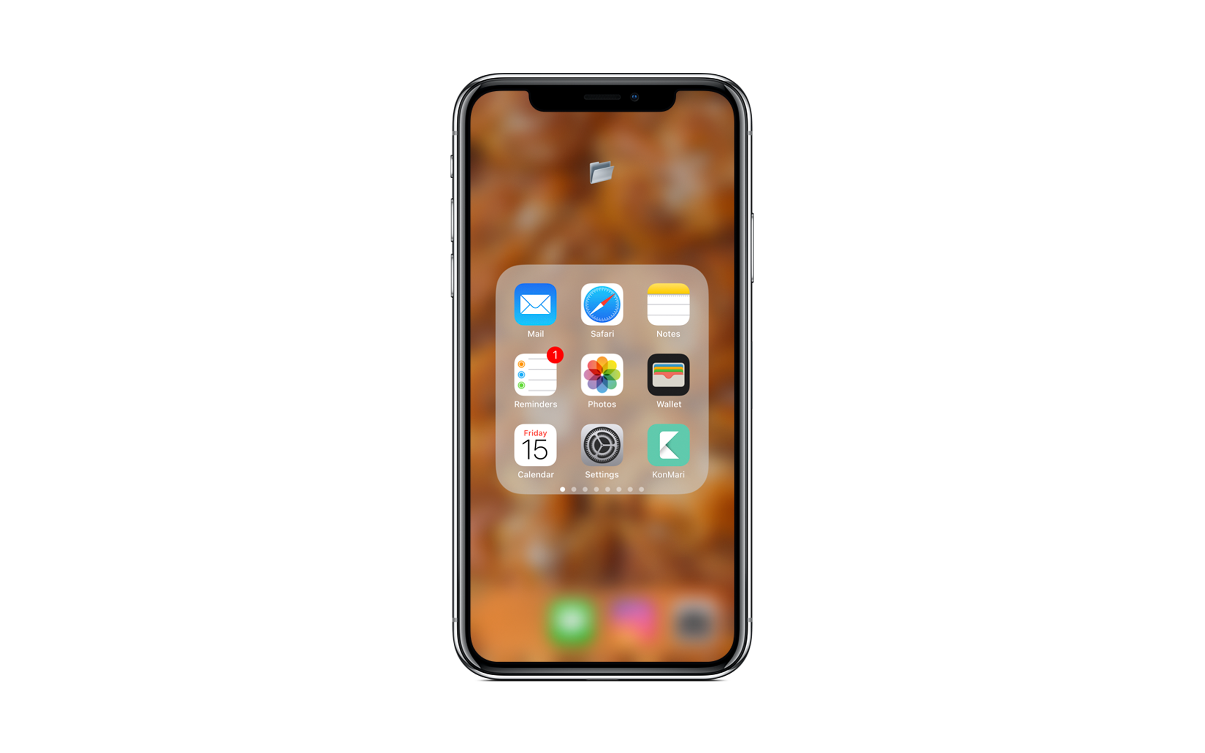
Audio sample for the iOS app
Audio sample for the iOS app


I shot custom photography matching the brand look. Ownership of all creative is the only way to position a brand properly.


About
Keep the inside beautiful
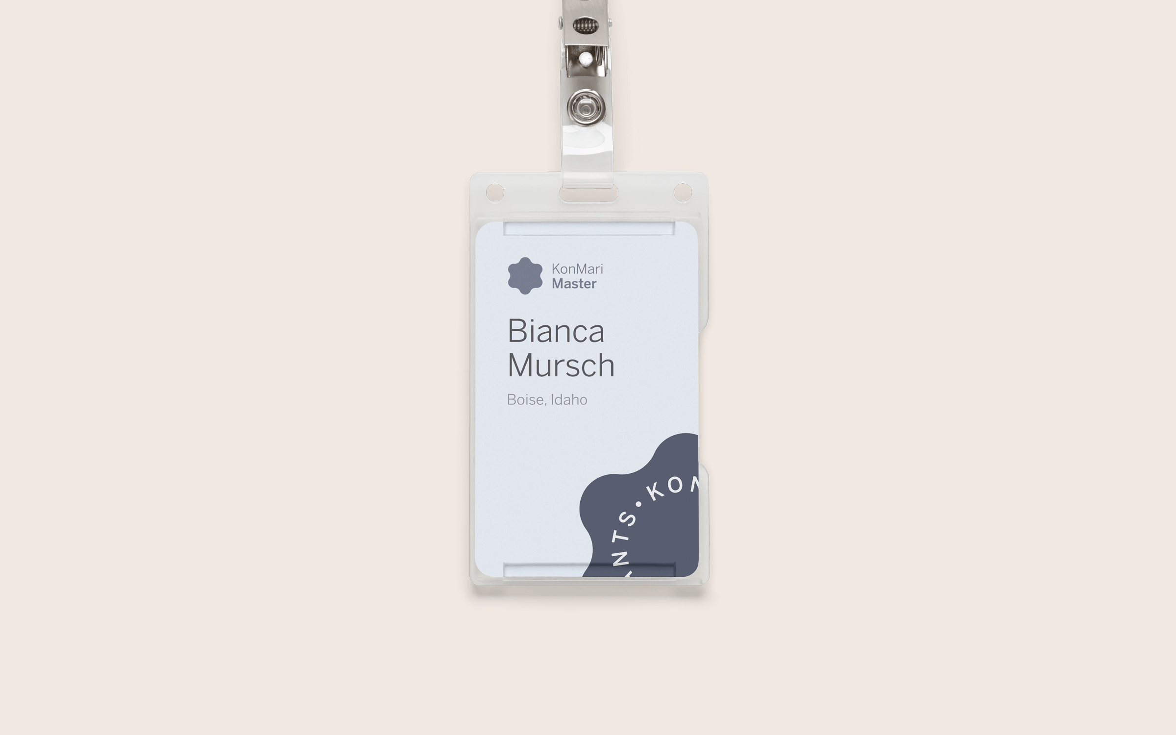
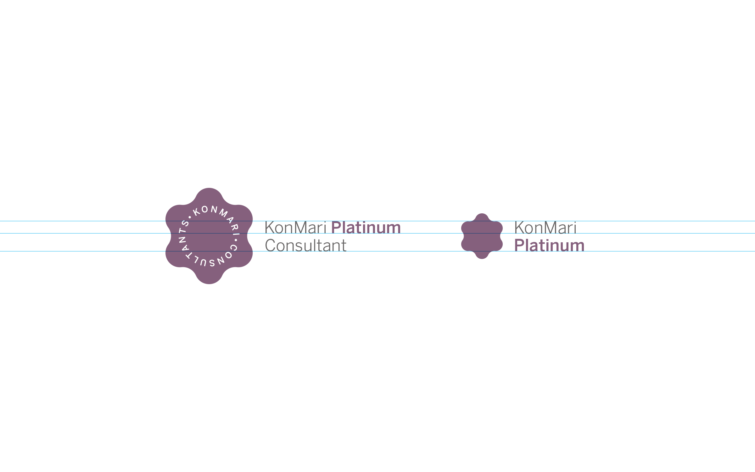
Marie Kondo and her family of brands — KonMari, Organize the World, Spark Joy, and Consultants — interact with people through many different points of contact. But in each case, the brand should speak the same message.
Values
The memories that the objects brought us and their meaning to us today. Do they spark joy?
Energy
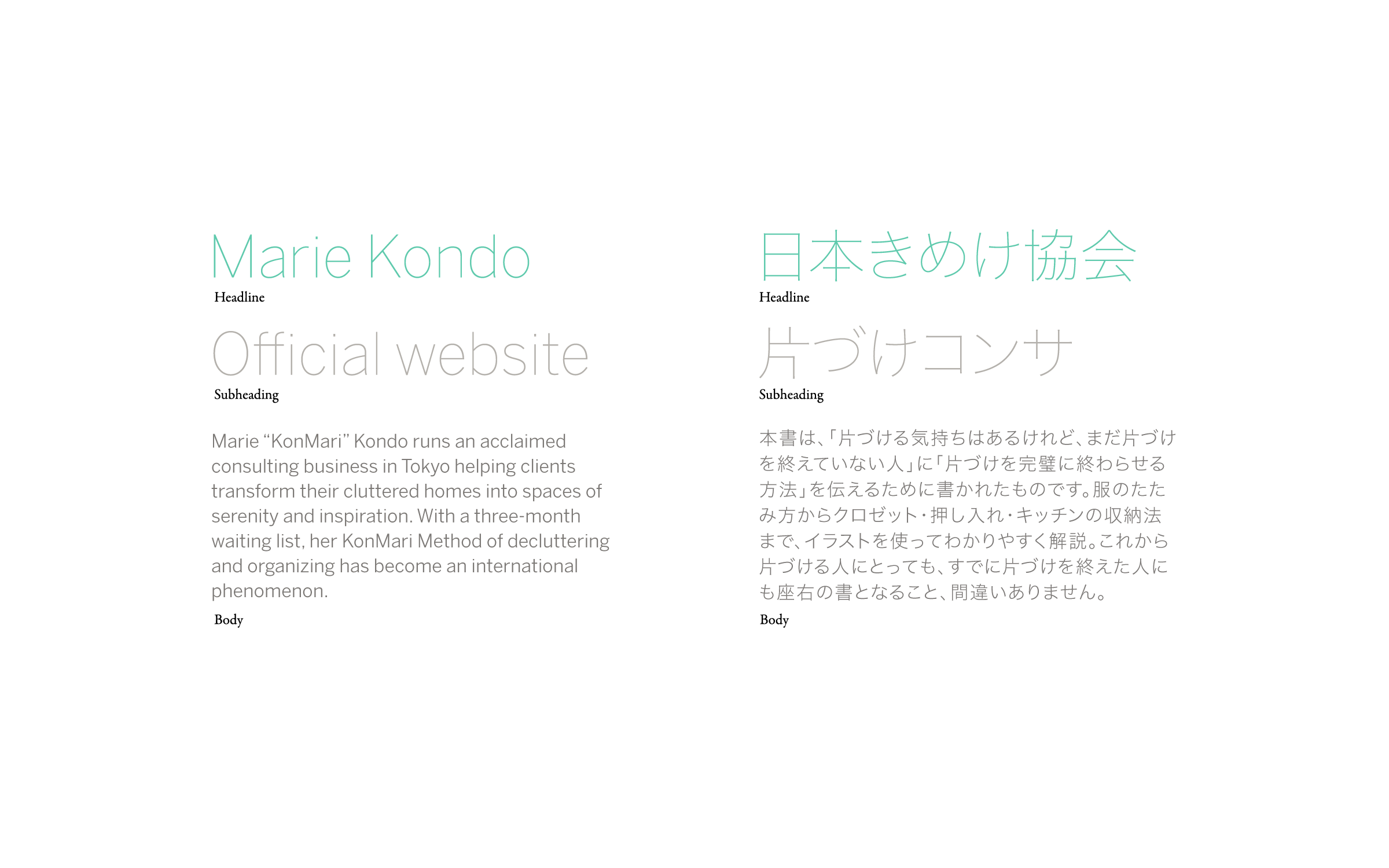
Benton Sans forms the entire typographic language for Marie Kondo. With historical references and humanist curves, the open letterforms achieve perfect harmony with their surroundings.
Material
Natural, honest, open. Materials should communicate their purpose and remain visible. They should be pure and unadulterated — closest to their natural state.
Function
Objects with clear purpose and meaning are functional. Items do not need to be practical to have function.
Simplicity
Simplicity seeks to uncomplicate our lives: by taking away the items that slow us down or clutter our minds, we can seek emotional, mental, and physical simplicity.
Color
Our color palettes are based on nature: muslins, sands and dirt, minerals, and the sky. No colors in our palette derive directly from black.
Sound
Audio cues uplift and please the ear. The best sounds enhance nature’s own silence.