The artist’s encyclopædia.
Branding and user interface.
Artifact is an interactive web encyclopædia of art: one that invites its participants to reinvent the art world, together. I worked early on to define the interface and branding.
About
The founder and I worked over the course of half a year creating the encyclopedia’s user interface, product roadmap, and logo branding. The project was very ambitious: to become the record of truth for contemporary art with an online and offline authentication component.
Artifact has launched and used the basis of my user interface designs quite nicely. The branding was too experimental perhaps for their launch, but to date, it is one of my favorite projects I worked on.
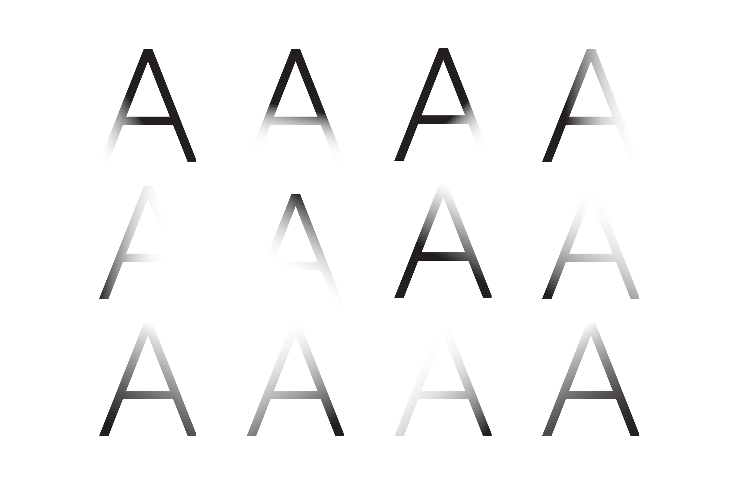
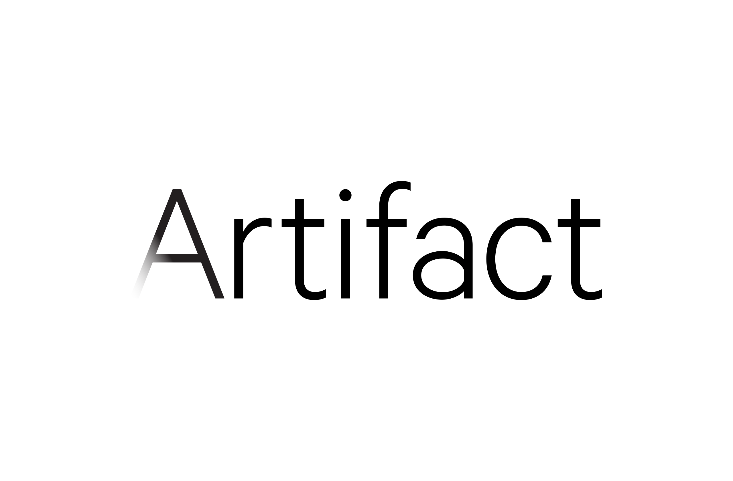
Much like the shifting landscape of art, I introduced the idea of a “shifting” logo that took advantage of different orbits. The orbits obscured and revealed the logo at different points.
User interface
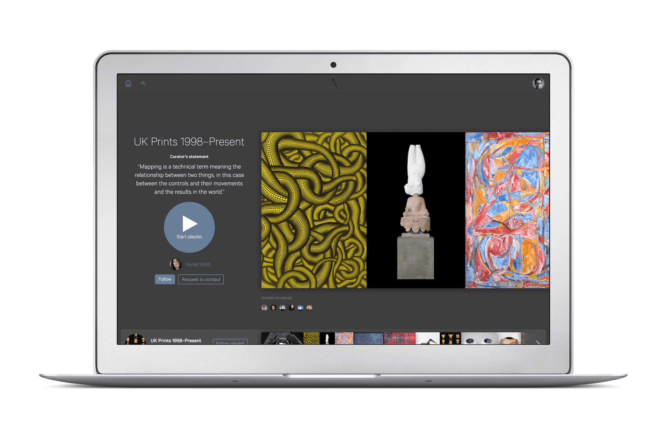
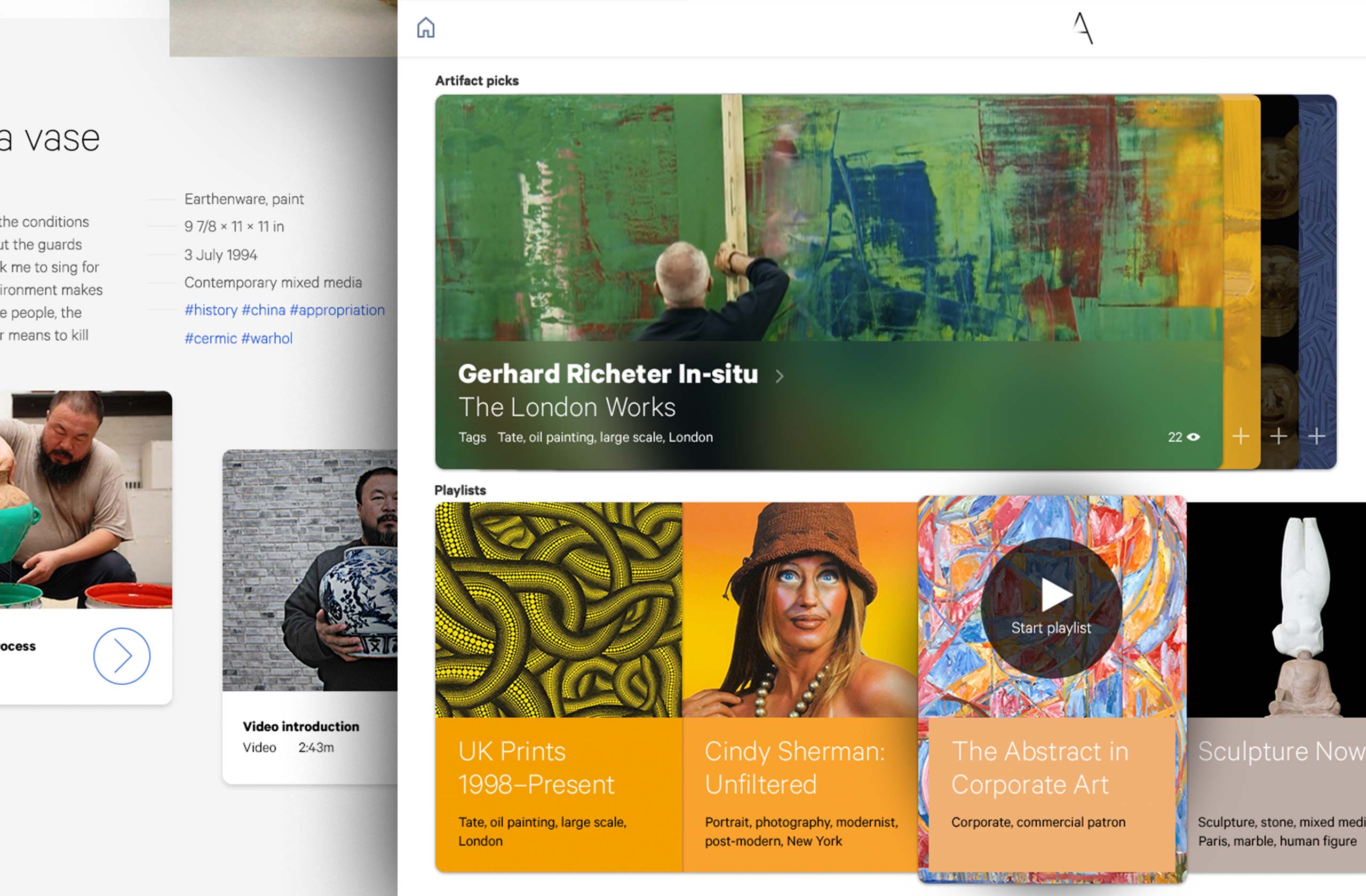
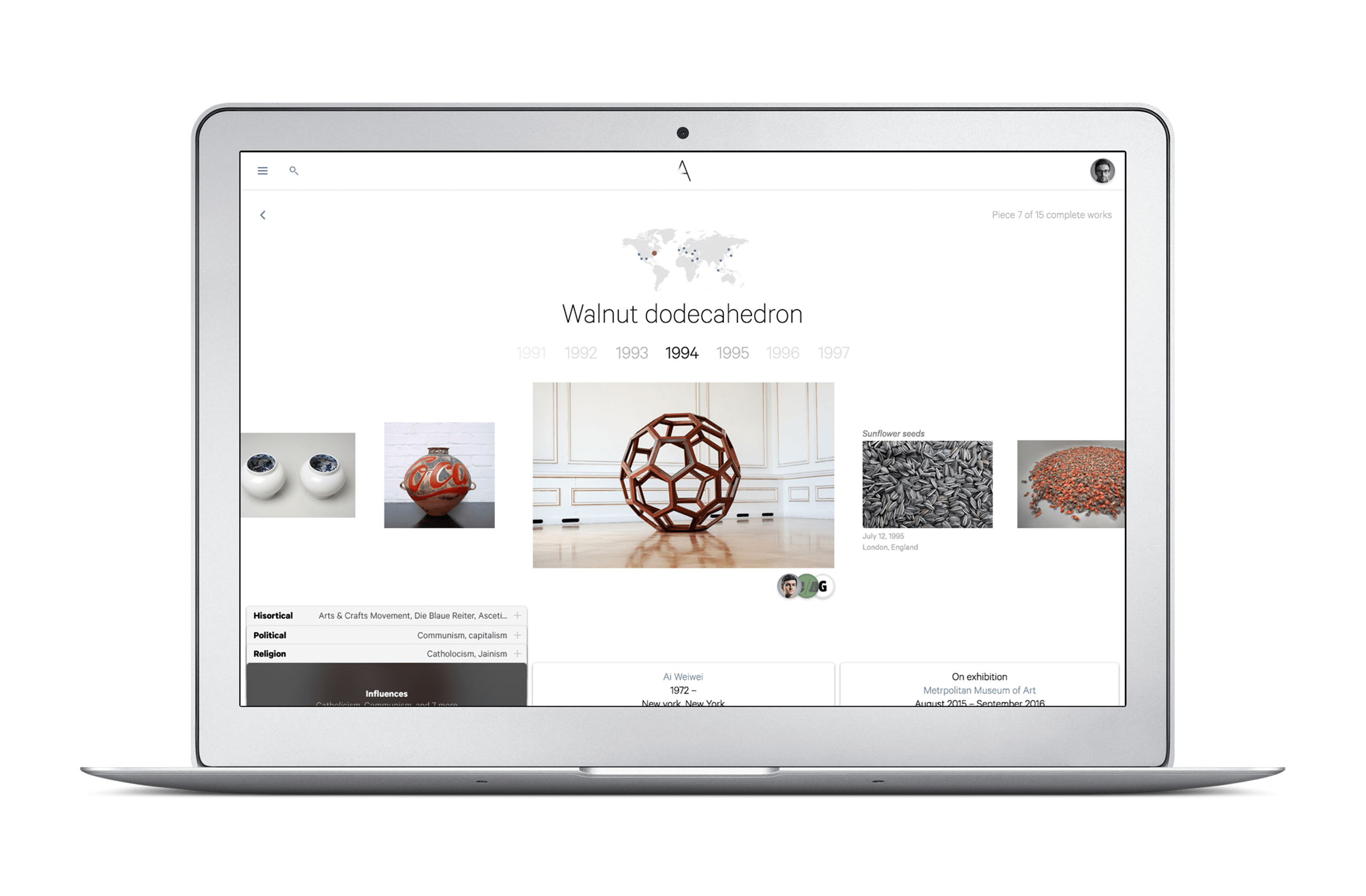
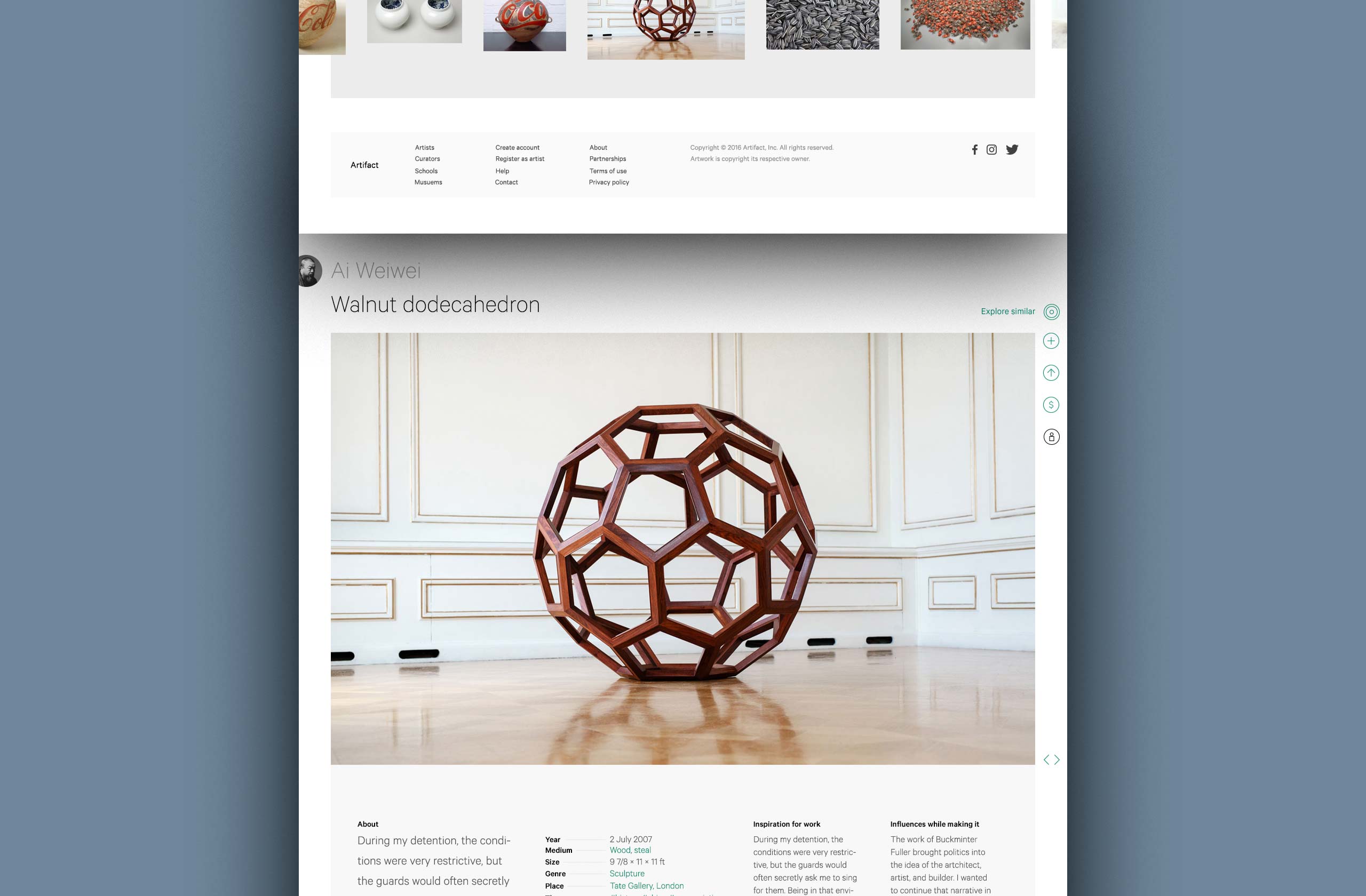
Web-based Application
A complex system made simple
On Artifact, one can follow favorite artworks, discover new featured artists, and sift through the database with new lenses like influences, references, geographic locations, global events, and art types.
Logo
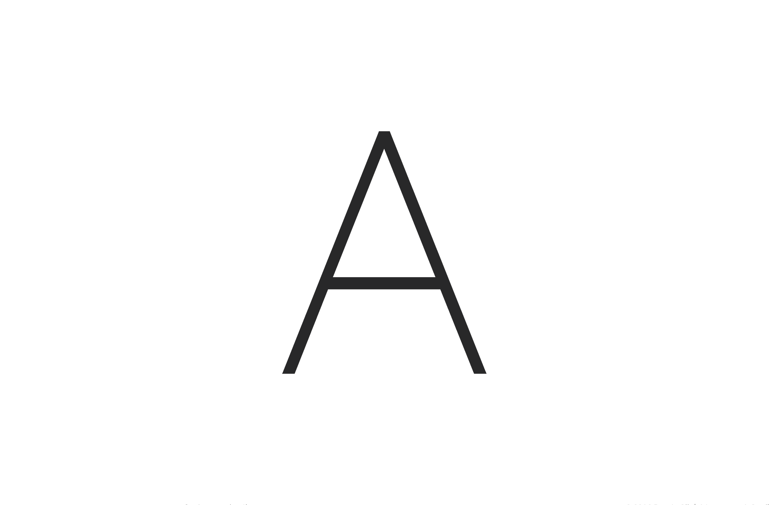
Identity
Orbits
The Artifact logo took advantage of “orbits” which were different placements of sun flare or glare from a distant object.
Product renderings
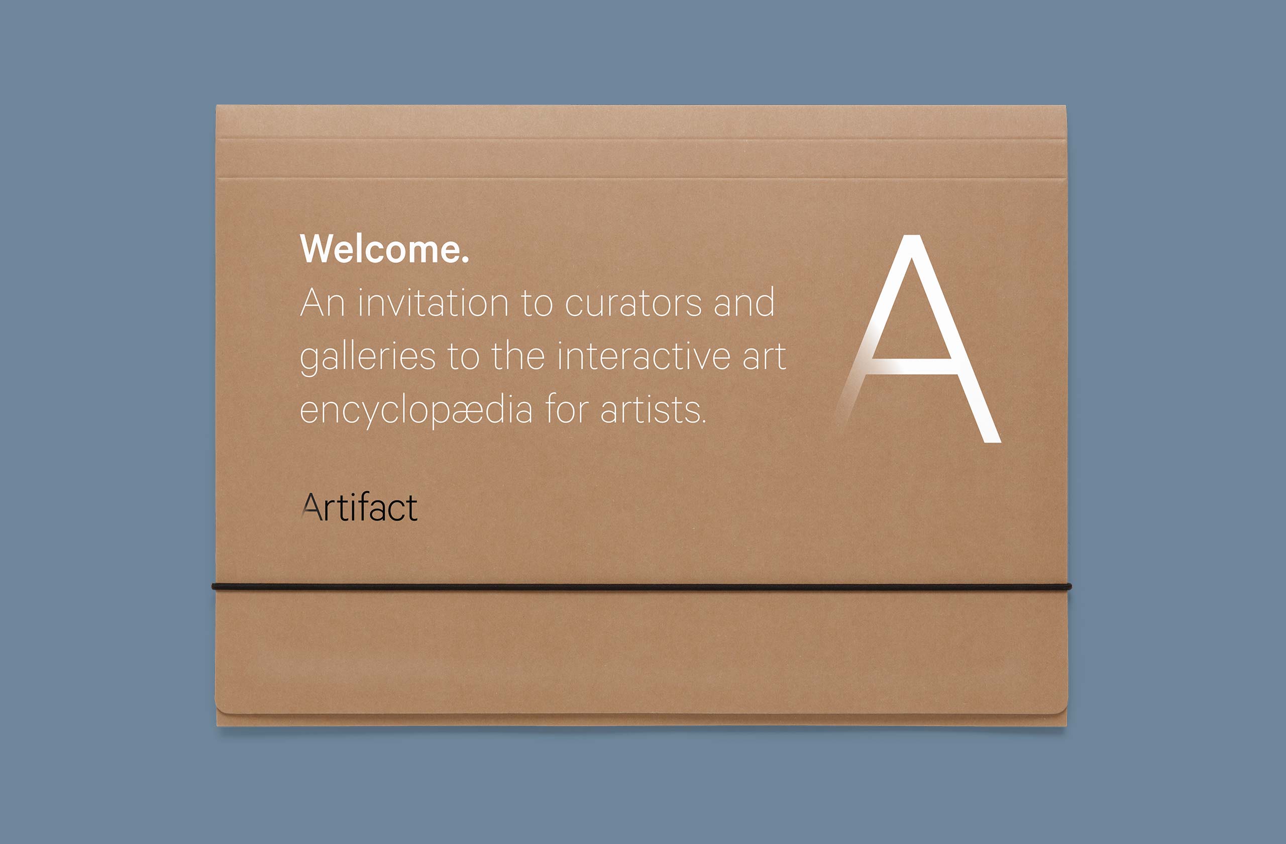
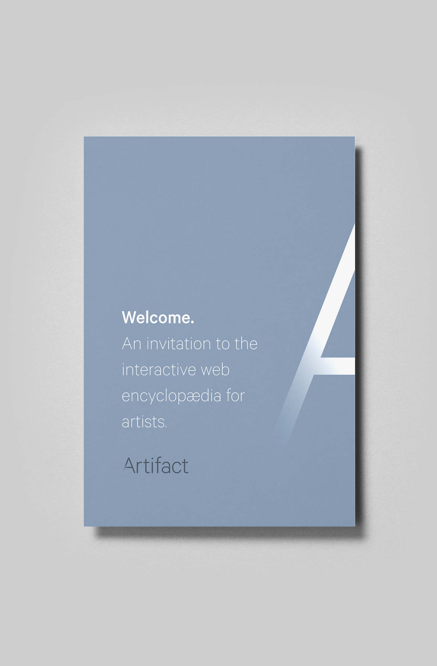
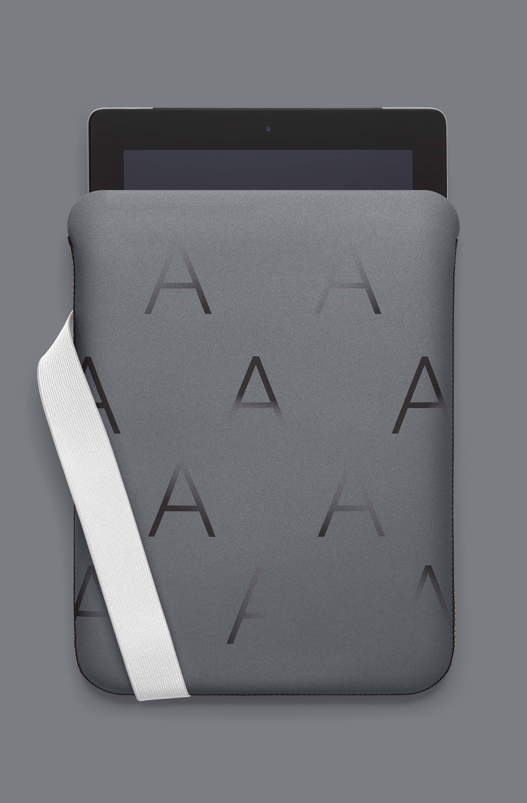
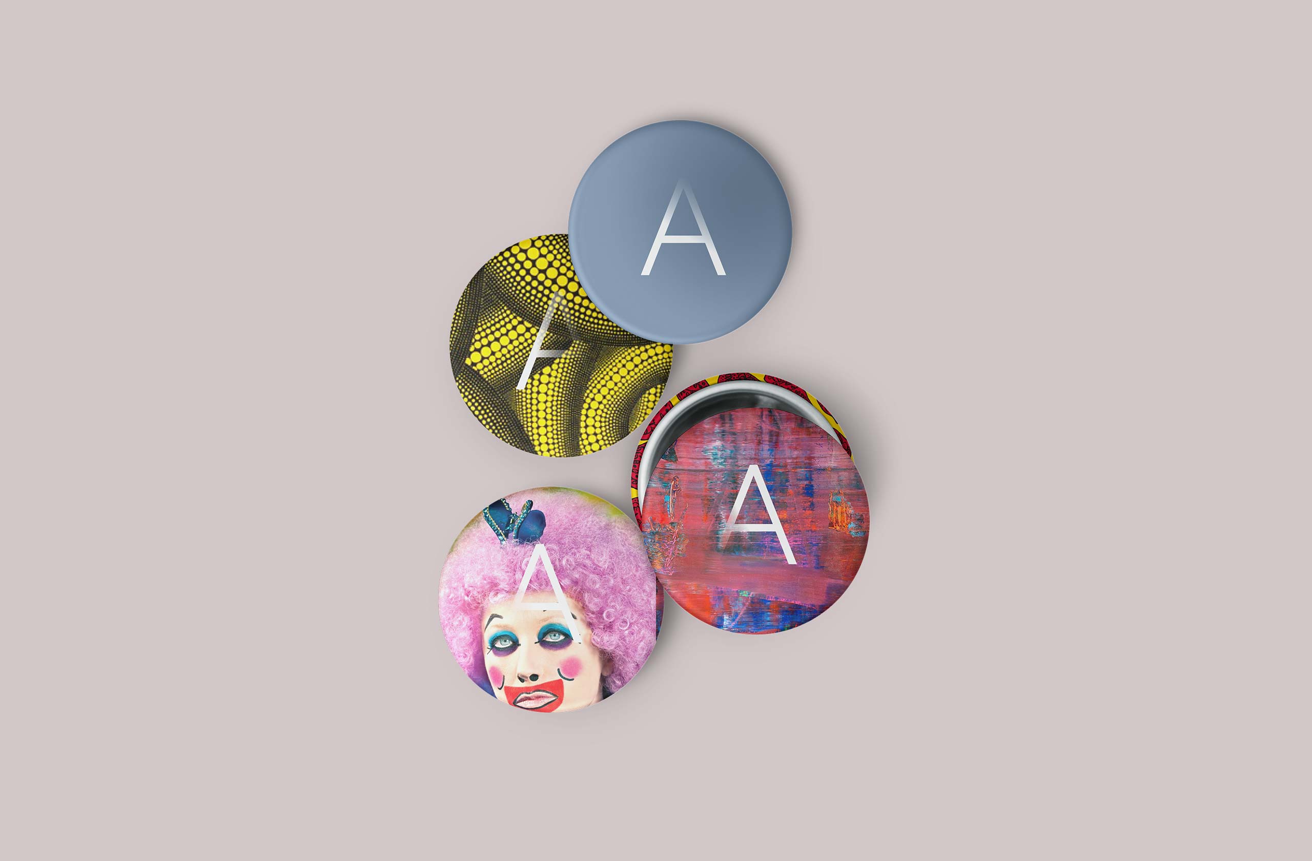
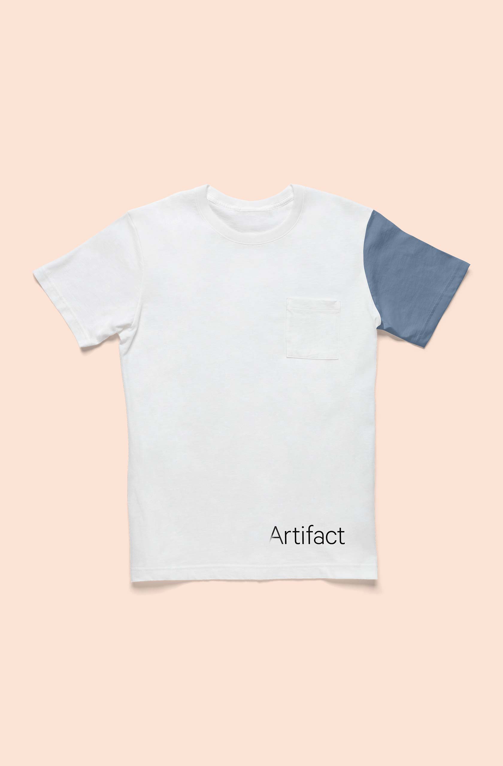
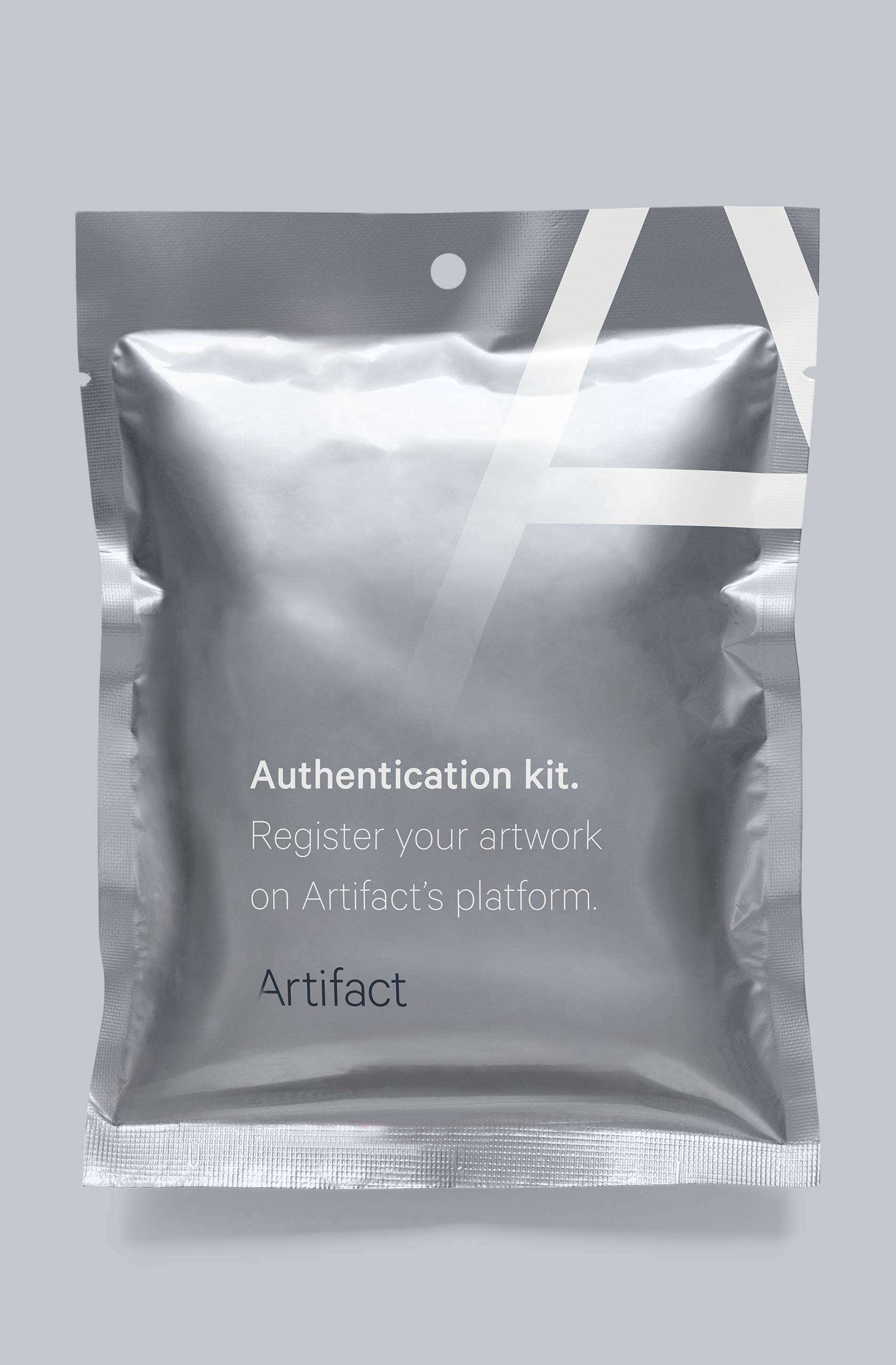
Example uses of the brand
Creating a Tactile Experience
Product renderings were produced to show different collateral for Artifact. Authentication kits and other collateral would be sent to artists to verify their artwork for the online platform.