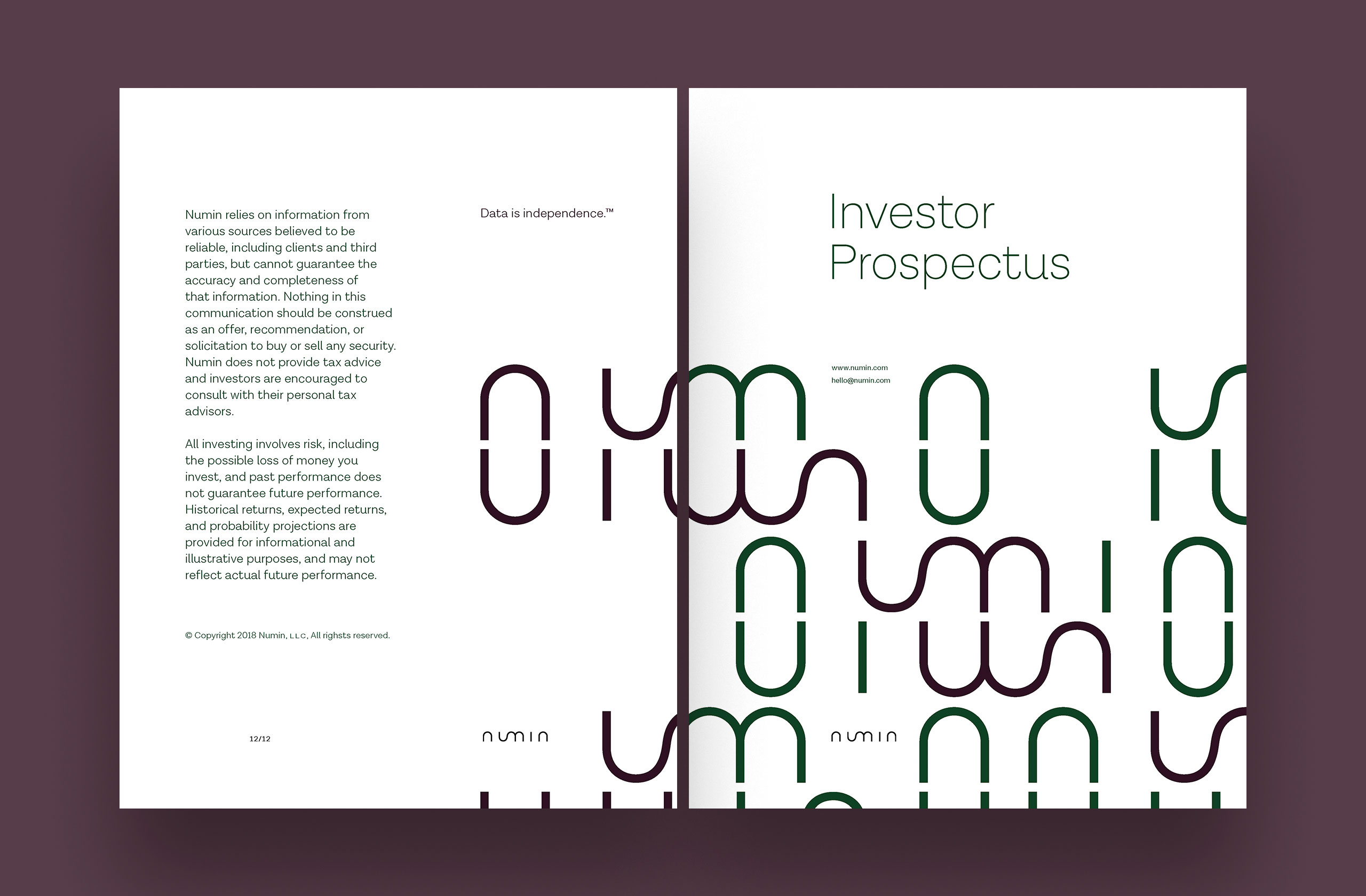
Data is independence.
Branding and user interface.
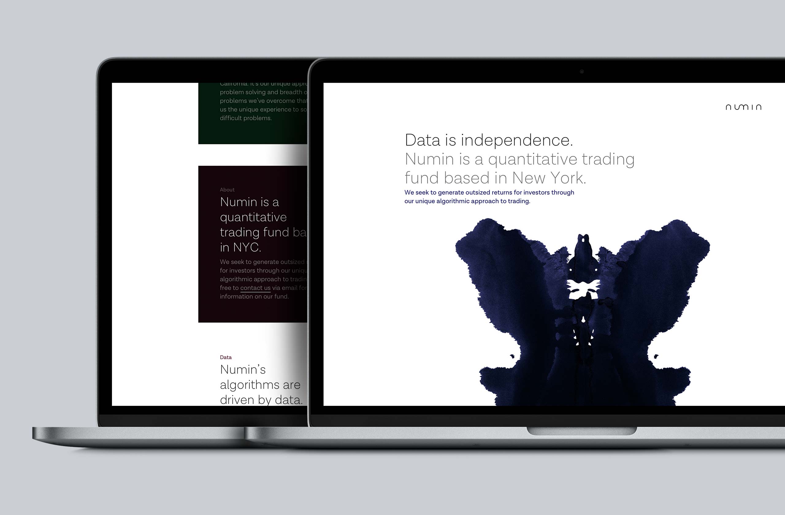
Numin is a quant trading firm founded by former Google engineers and based in New York. They bring an automated approach to investing.
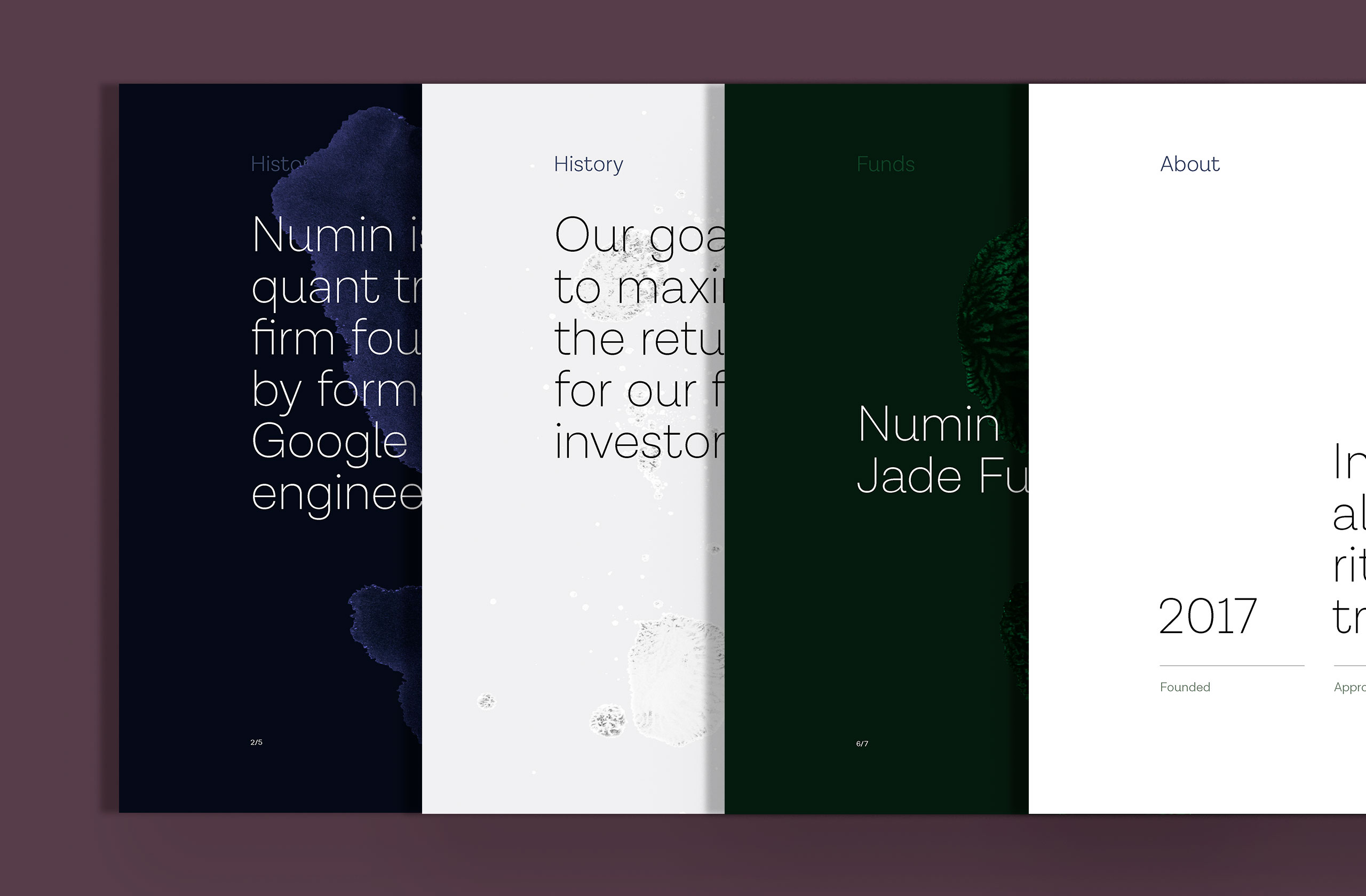
About
What makes Numin interesting for me is that the company approached me before it had a name. Here I was task with not only developing a logo design, but also naming the organization itself.
My technique was decidedly old-fashioned: I took an old dictionary off the bookcase and began flipping through the pages. I wrote down any word that resonated with me and the idea of algorithmic investing.
Equipage (Equitable?); Azimuth (too technical); Aon (misspelling of Aeon); Able; Abacus (too obvious); Acacia; Agouti (a type of rodent).
I gave up on the A’s.
Then I took a cue from many brands, and decided to create a portmanteau. And thus Numin was formed from “numeric” and “investing.”
The name seemed instinctively to want to be hyper-modern: sinuous but architectural, organic but geometric. Just like the name and the algorithms, the logo would be constructed artificially. I drew the logo by hand then spent time turning it into a vector graphic. A logo this bare requires many optical adjustments to execute well.
Logo

Identity
Metrics and optics
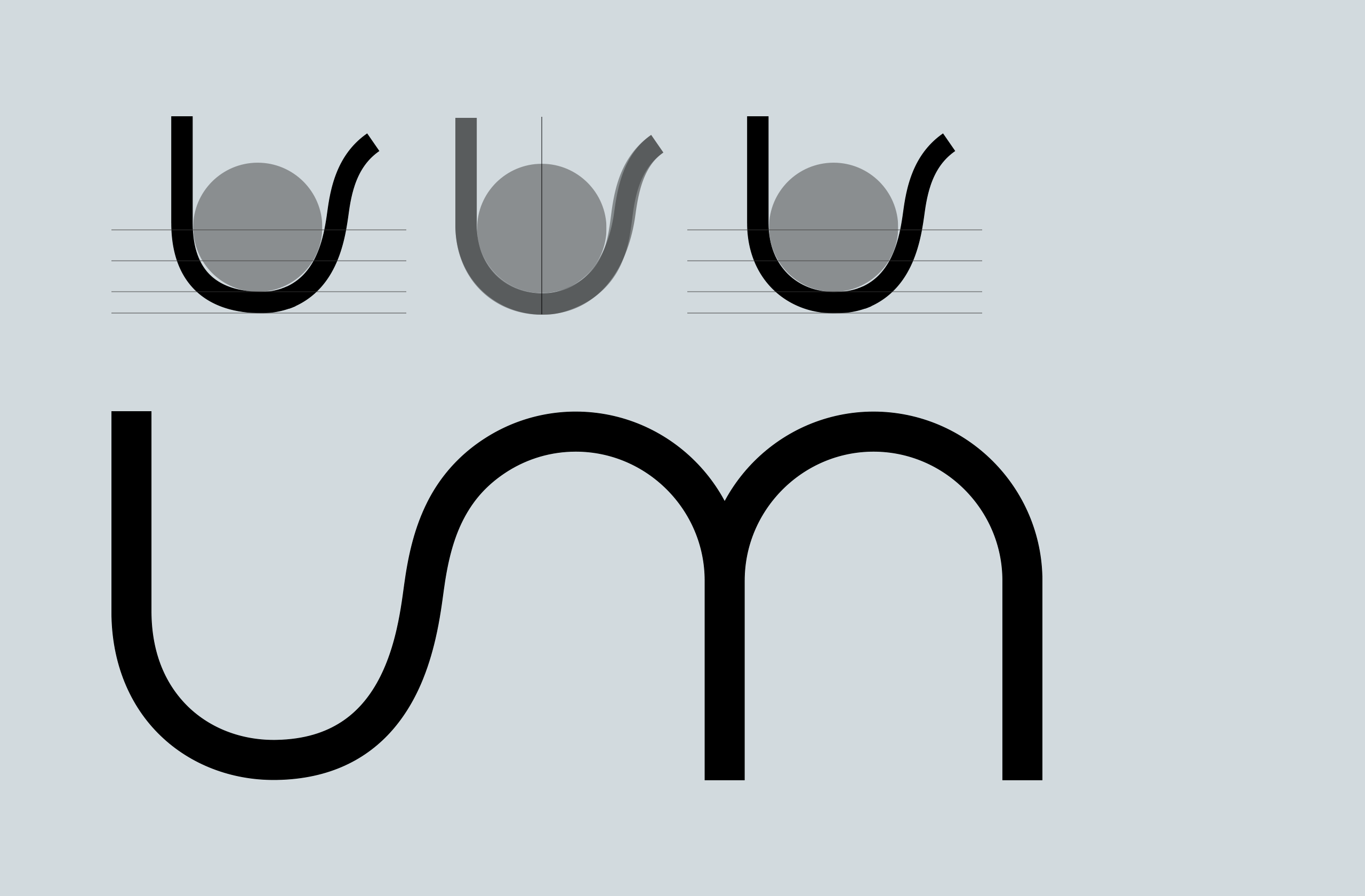
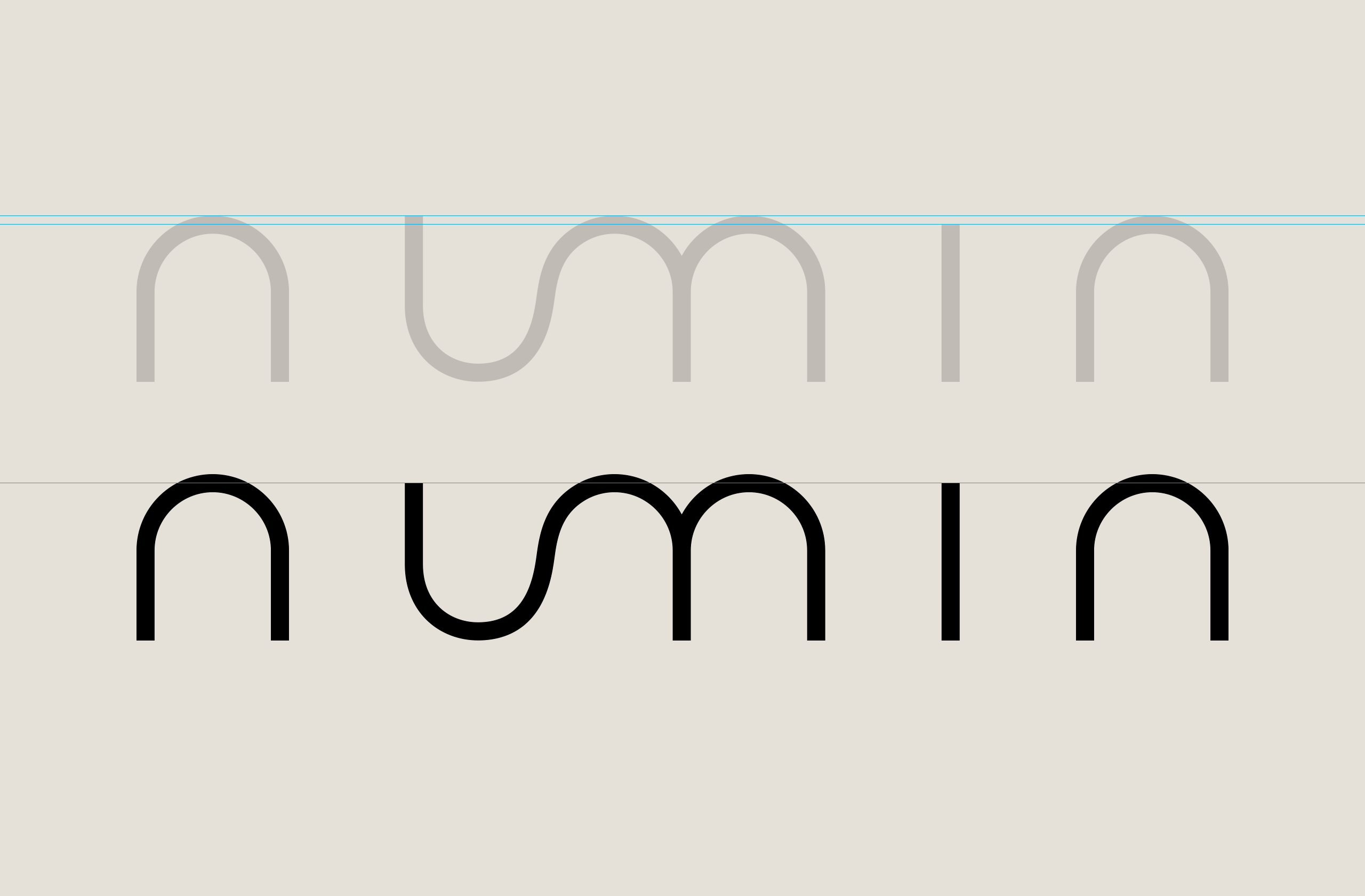
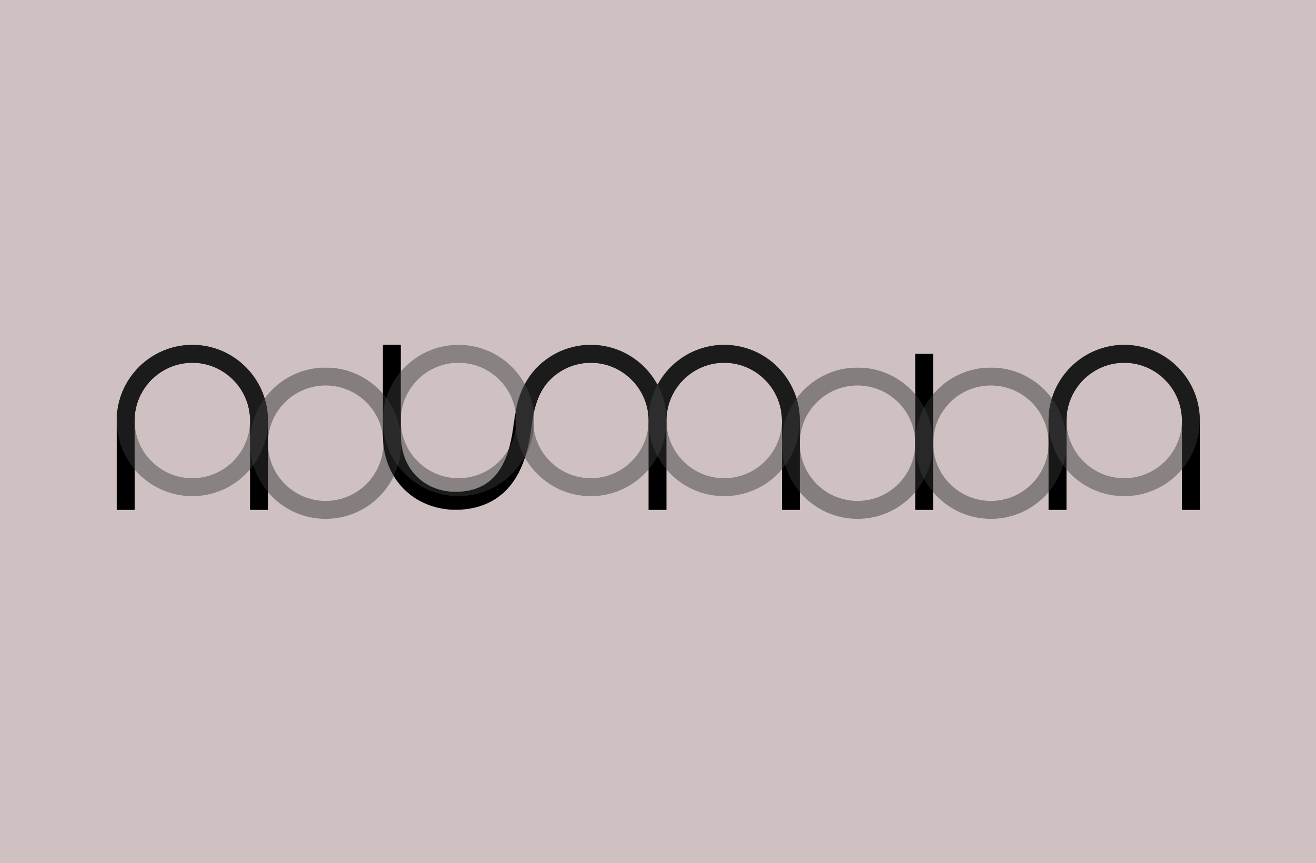
The logo is fairly simple at first glance: geometric and unfussy. The "u-m" ligature is meant to reference the smooth curves of a graph or chart plotted by an algorithm. But the connection of the two curves was not easy for me to merge. Easy to draw, hard to digitize. It took about twenty-seven tries at adjusting the ligature connection before I was satisfied. The solution was neither purely geometric nor purely optic. Other considerations like spacing and the height of the descenders in the U and I letter forms needed to be resolved to some satisfaction. The end result is a graphic, stark, and clinical logo that has a hint of juvenile playfulness left in it.
Marketing

Example uses
Numin branding
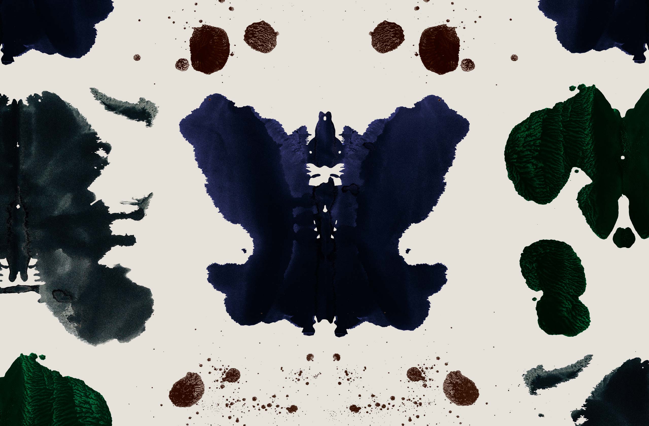
I introduced Rorschach ink blot motifs into the marketing design work both for print and digital. They were created with India inks on Bristol paper and digitized. The ink blots also recall MRI scans of the brain. Outside of this graphic indulgence, the design is kept simple and grid-based in the tradition of Modernism.