Robots that build the world.
Branding, Communications, and Design.
During the branding for Built Robotics, I created a purposeful, no-nonsense brand for a startup that aims to build the future of construction. Touchpoints included construction vehicles, clothing, print, and digital.
About
What will construction look like in a generation? Built Robotics develops solutions for the toughest problems in the industry.
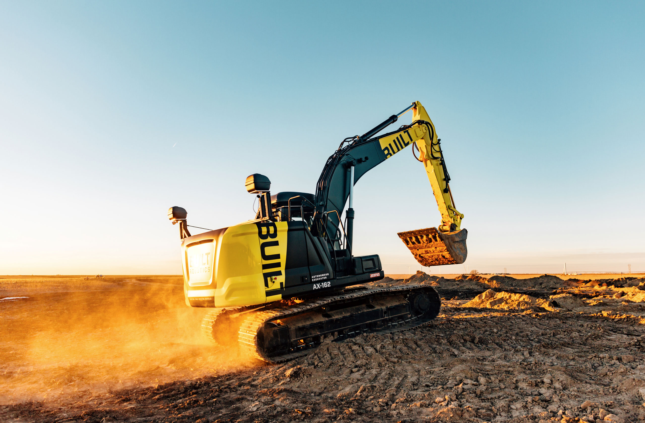
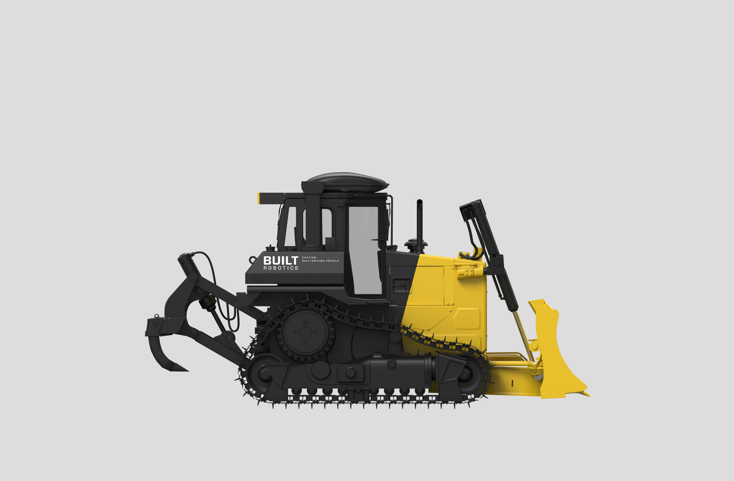
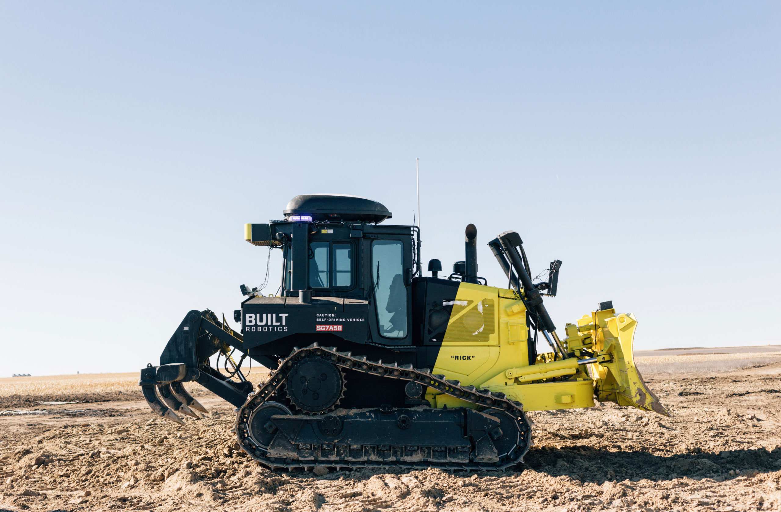
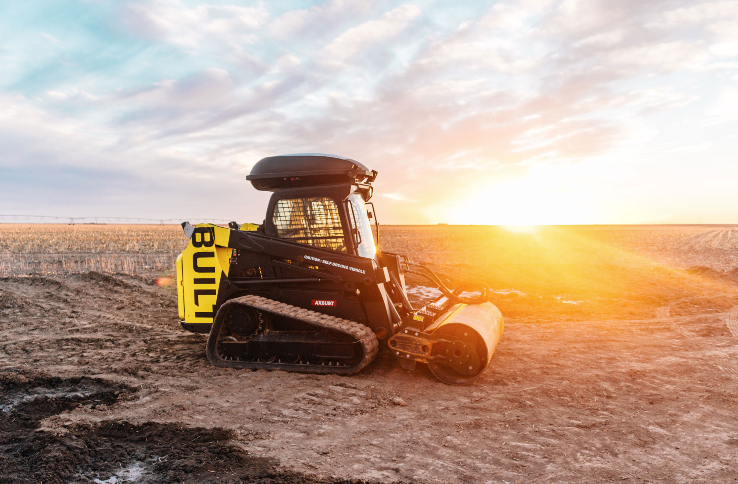
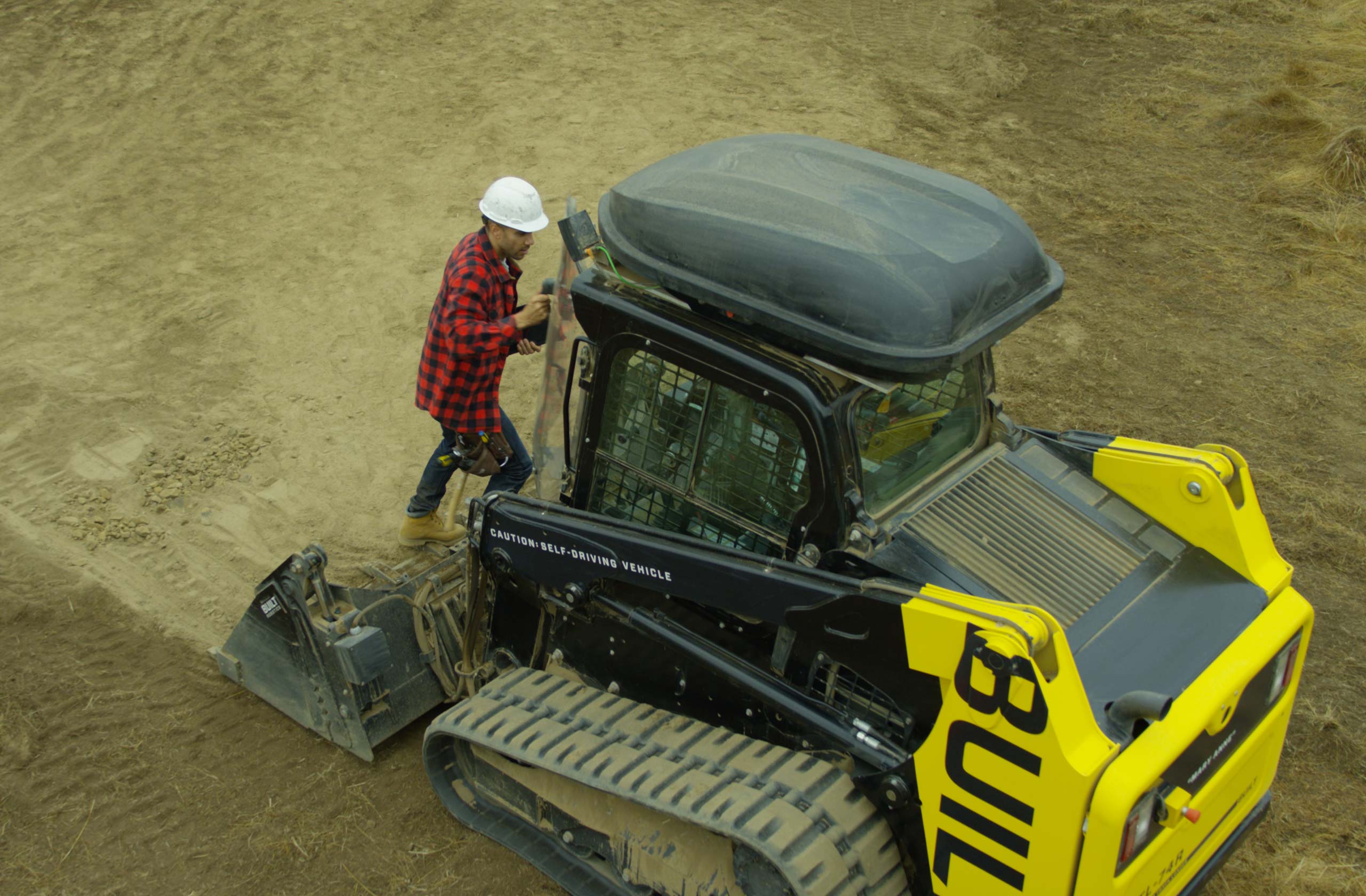
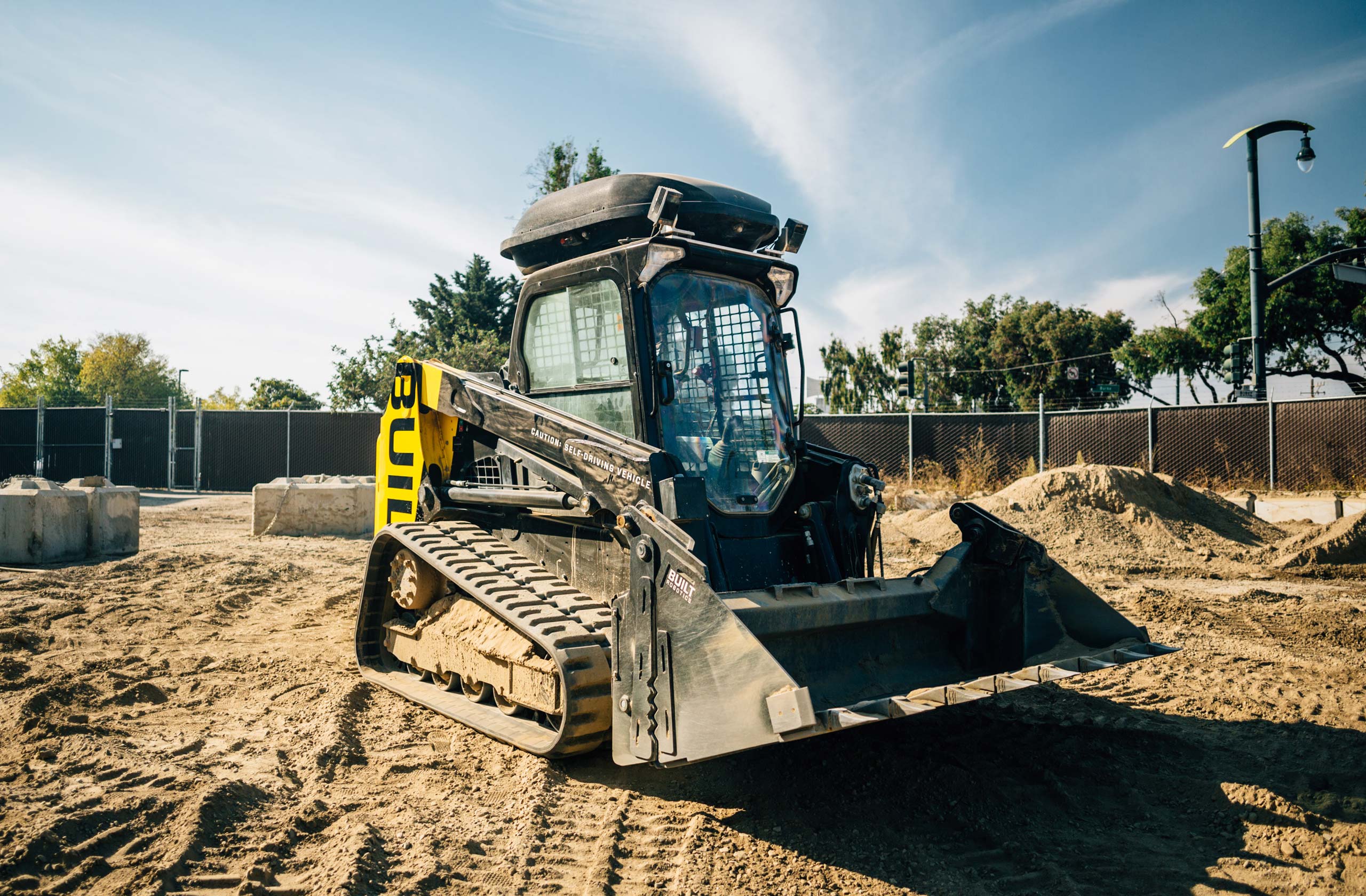
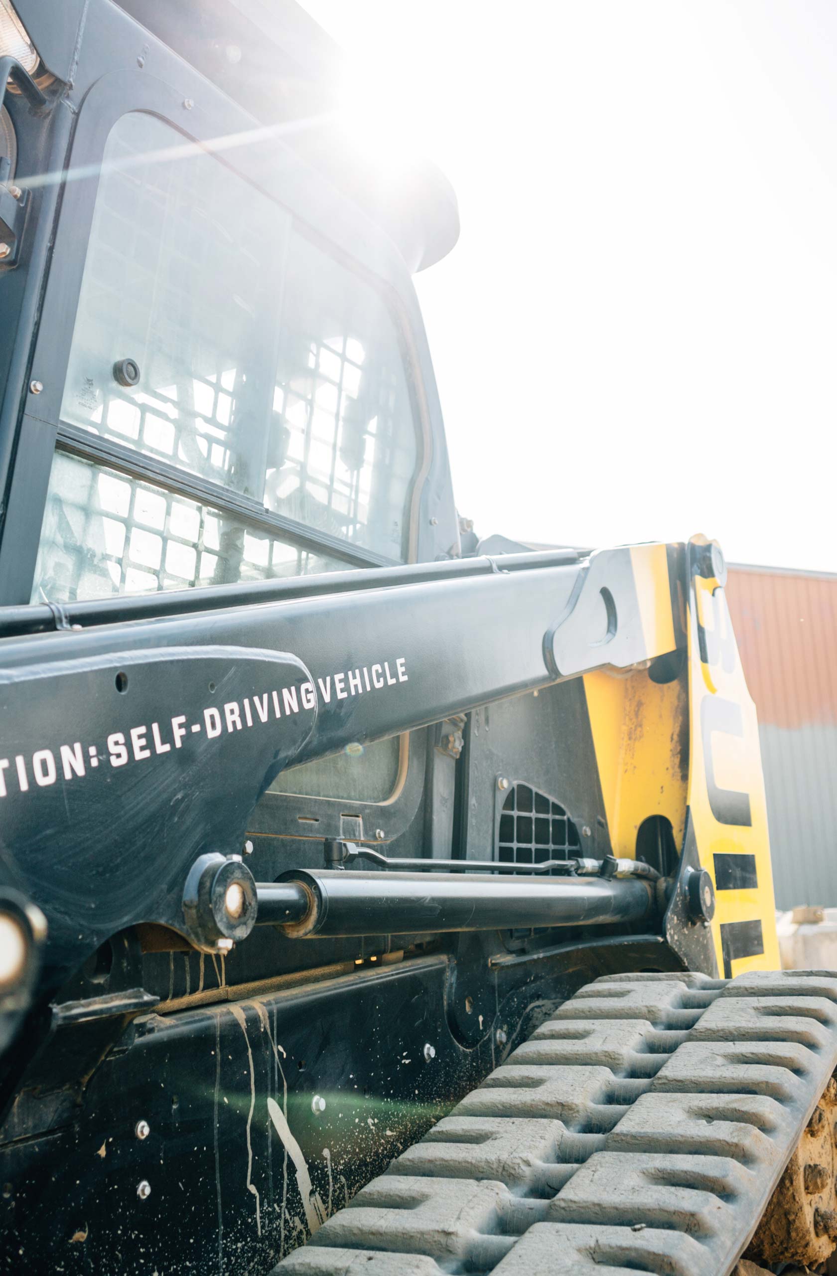
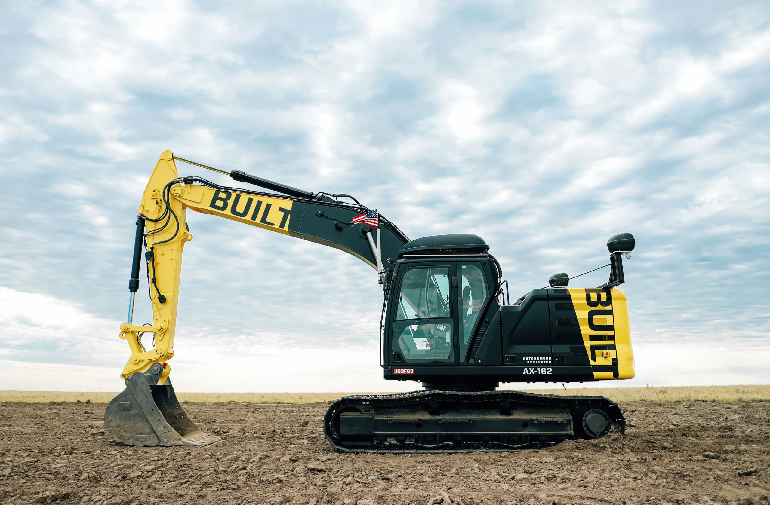
Their first vehicle is autonomous, smart, and efficient: the ATL-74R. It takes the latest sensors from self-driving cars, retrofits it into proven equipment from the job site, and develops a suite of autonomous software designed specifically for the requirements of construction and earthmoving.
I have been working along with Built to develop branding, vehicle livery, and photography for the brand both for today and tomorrow.
Branding


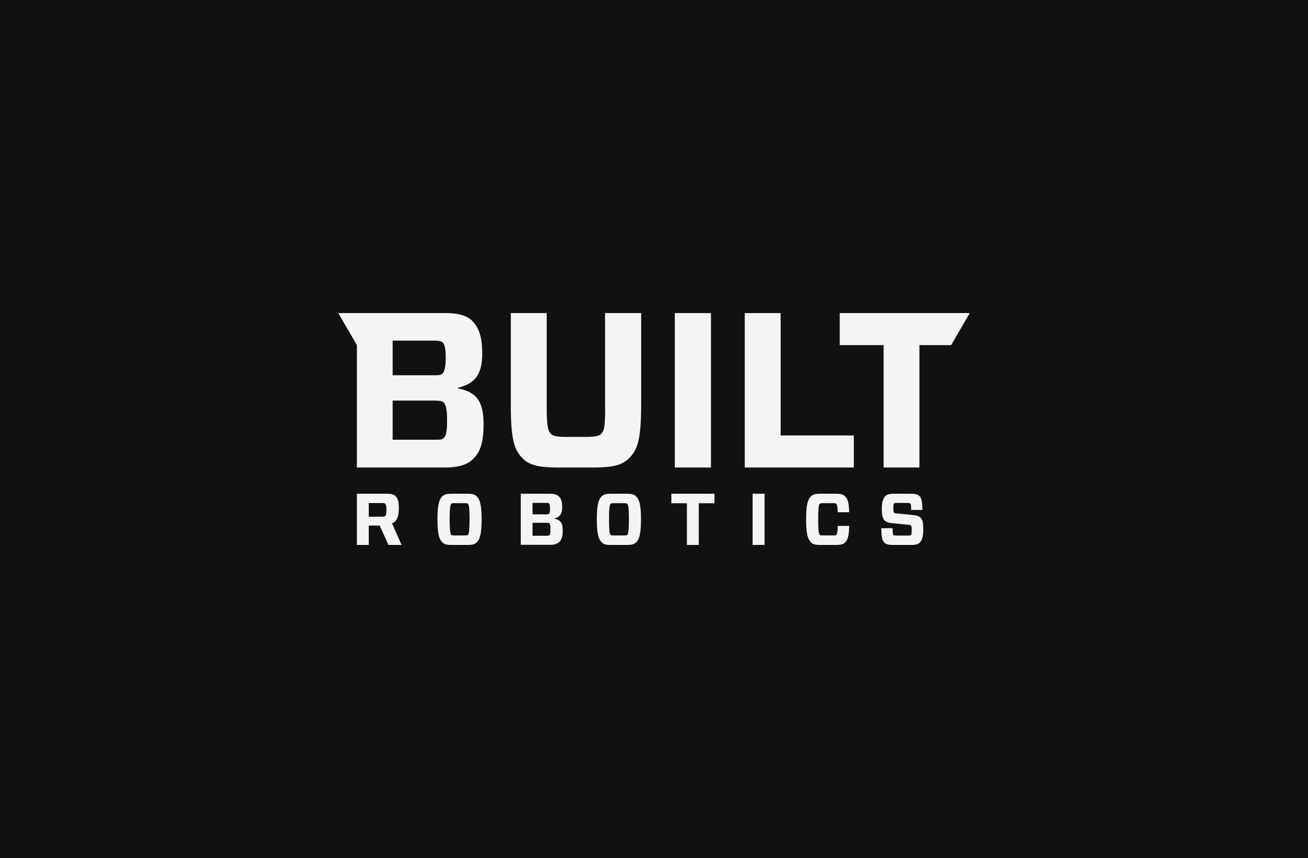

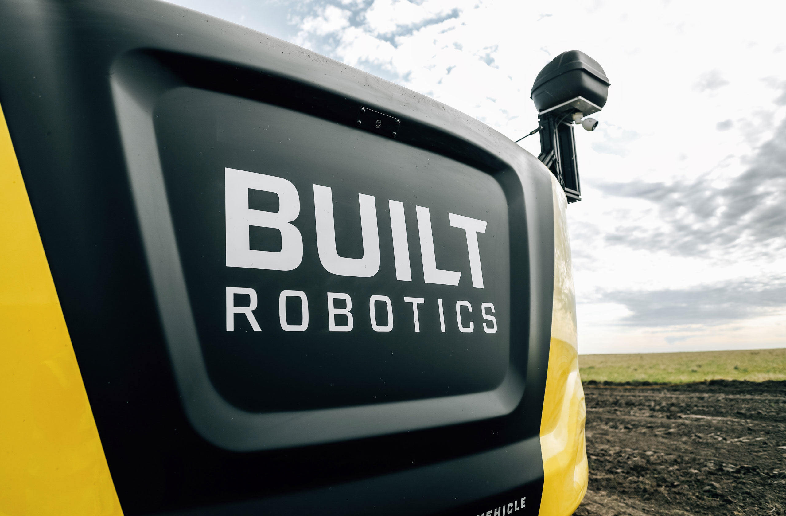
Logo.
Construction the pieces of a brand.
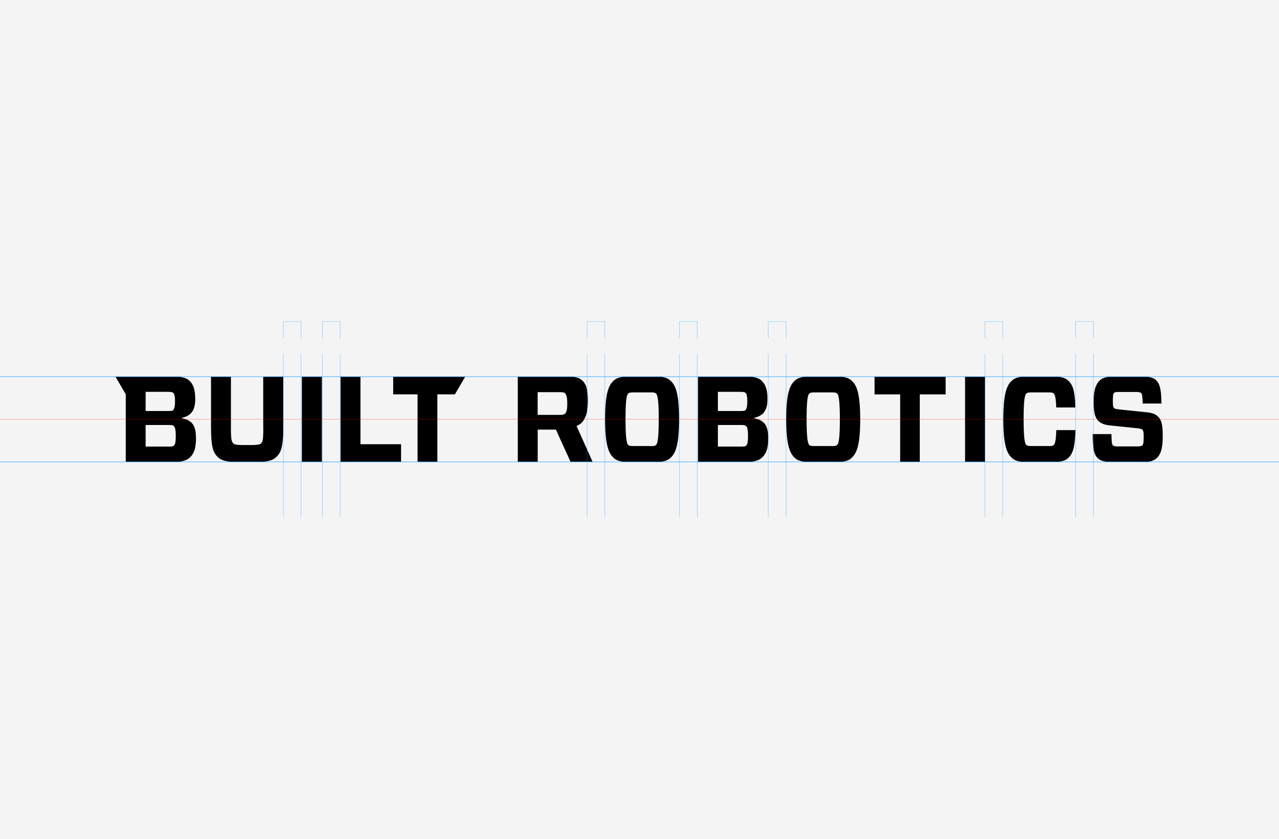
What will construction look like in a generation? I worked together with Built Robotics to develop a logo and brand that would straddle two industries: construction and Silicon Valley. Subtle adjustments to letterforms gave ownership to the typeface while preserving it’s optically sophisticated qualities. From the ATL-74R, construction livery, printed collateral, and on-screen design, elements of the brand carried over through all touchpoints. Forza is used nearly everywhere for type. The direct, straightforward cut of the letters is softened with Calibre in running text.
The Monogram
The initial letter functions as the logo or icon of Built Robotics.
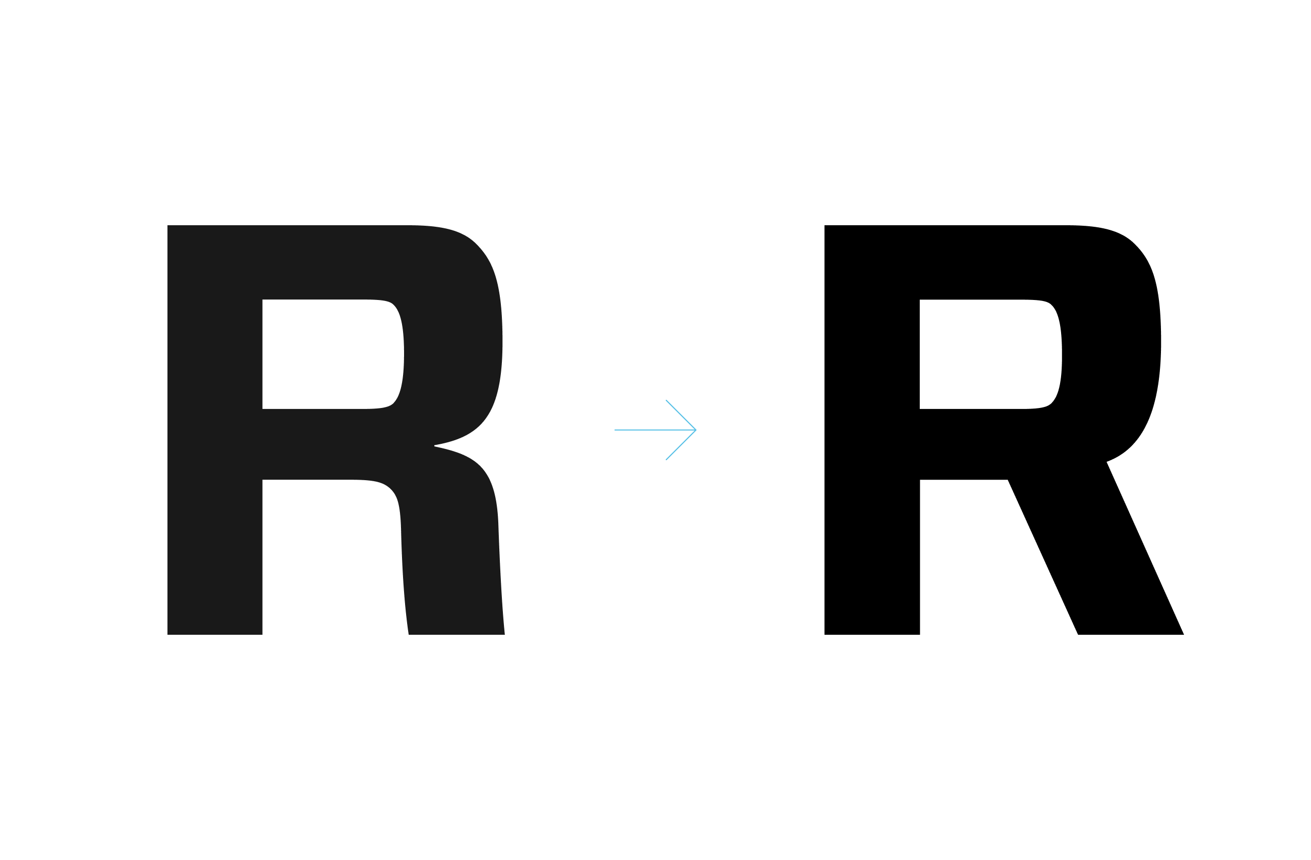
The Wingtip
The left wingtip solves the biggest drawback of the previous logo: ownership. By adding a custom element to the initial letter, we can take ownership over the letter. In avatars and spot treatments, the logo can stand alone. The wingtips now mirror each other on either end of the logo.
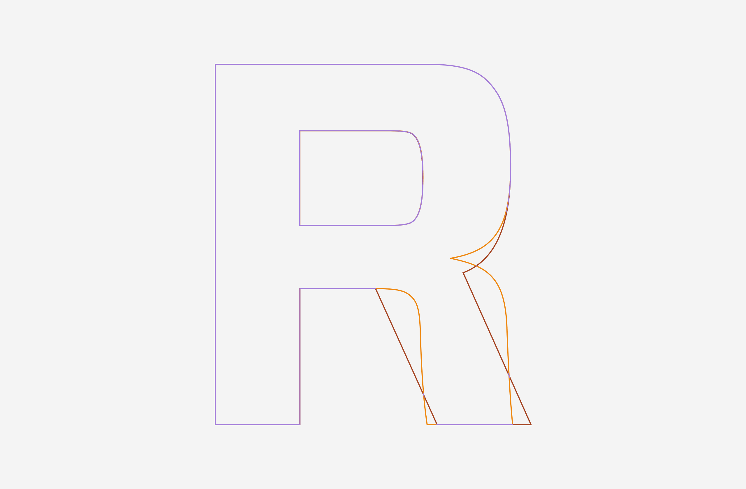
Logo Shape
The column shape manifests the classicism of a Doric capital: stability, symmetry, and strength. The balance of the wingtips helps resolve a long-standing imbalance found in the previous logo which tilted heavily to the right.
Character Adjustments
While optically balanced for the typeface, the L and T letterform bars felt thin and inconsequential in relation to the heavier letters like B and U. They’ve been thickened to give more overall balance. Likewise, to preserve the symmetry of “ears” and the uniqueness of the wingtip motif, the angled cut on the L has been removed.
Pattern Elements
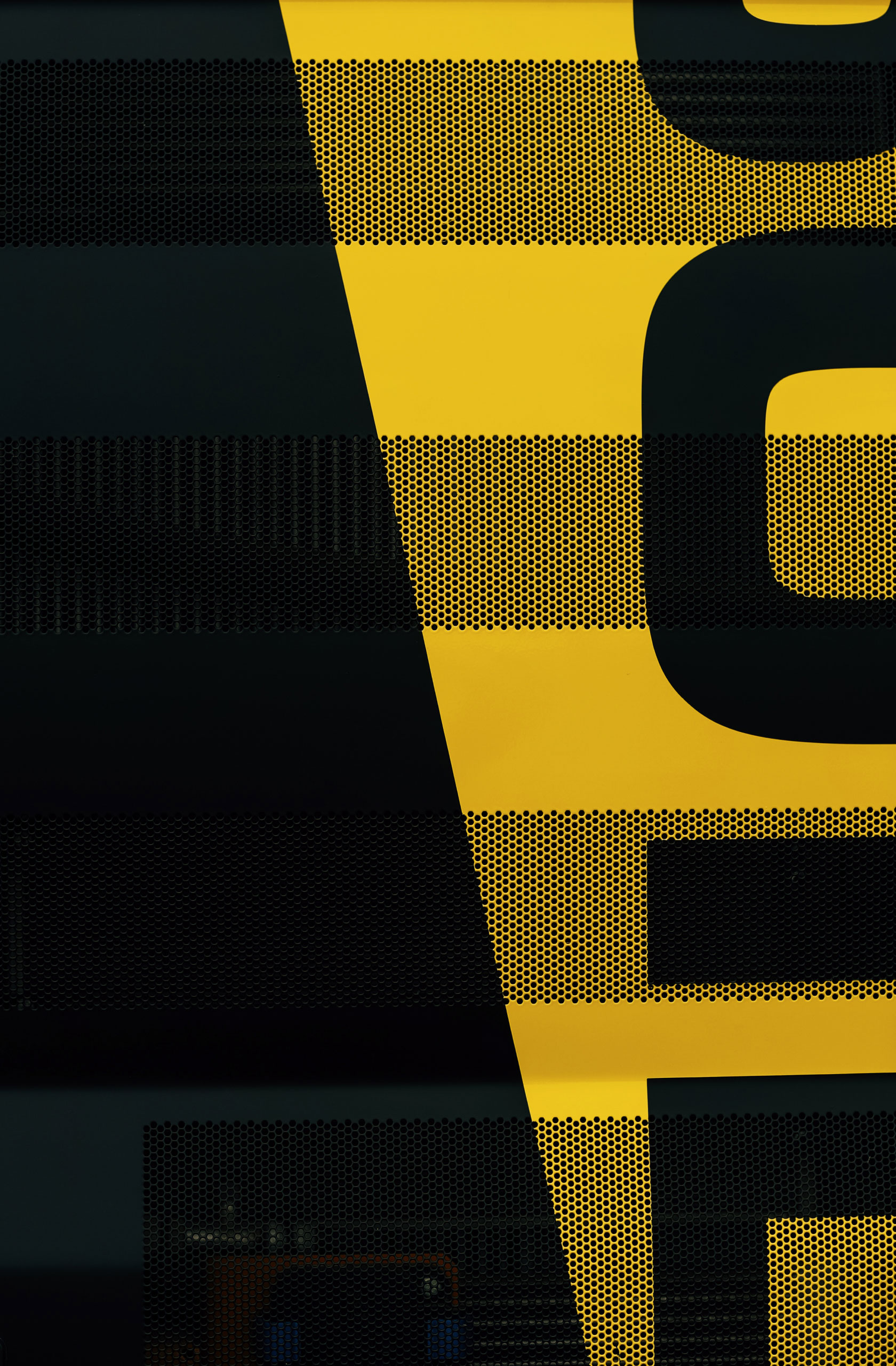
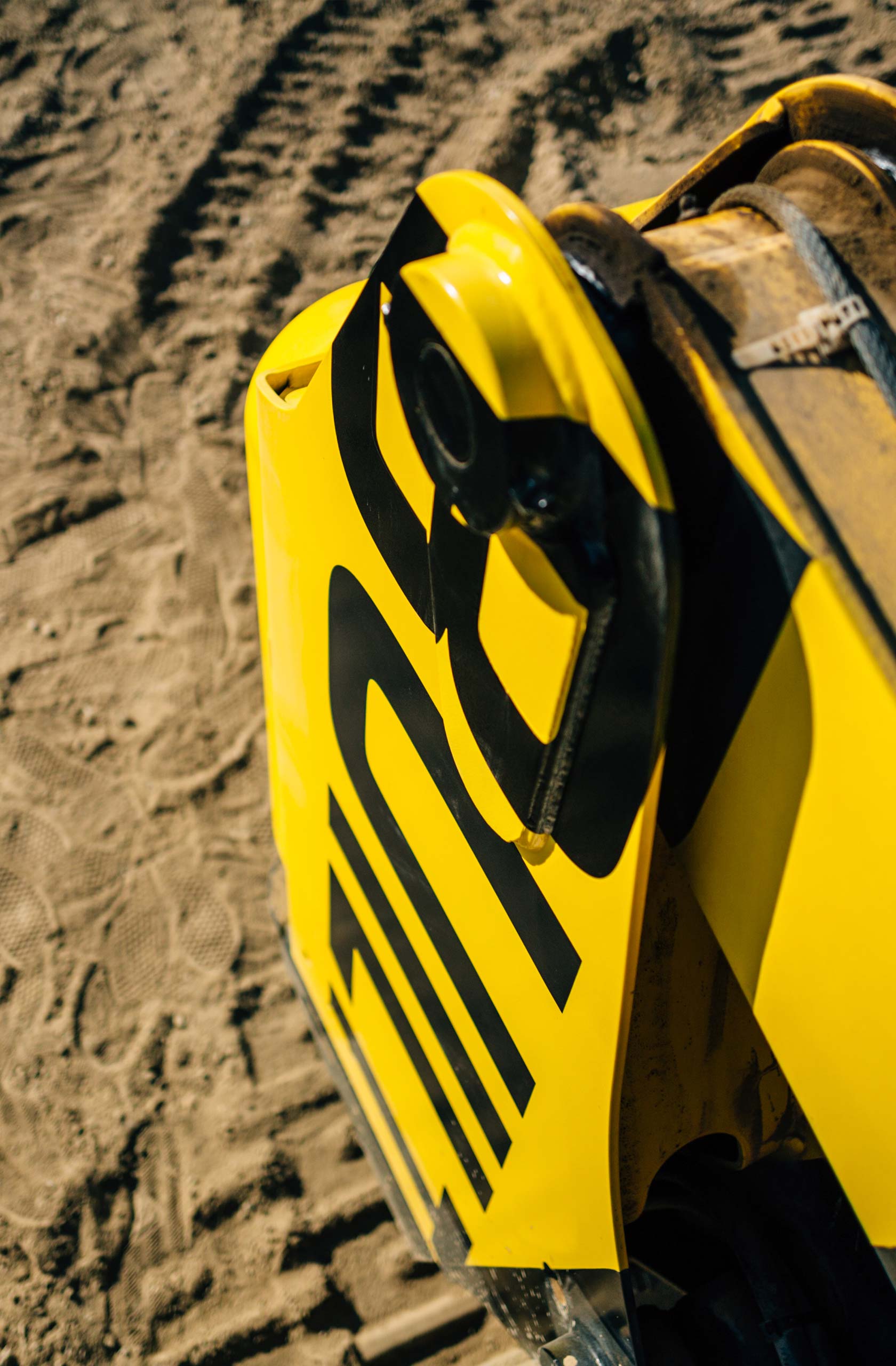
The wingtip can be utilized as the general rule for angles and cuts that can carry over throughout the entire system of the brand. It is a 60° angle. We’ve already used cuts or “dips” in material like the livery. However, now, they will tie back into the logo more obviously and be formally recognized.
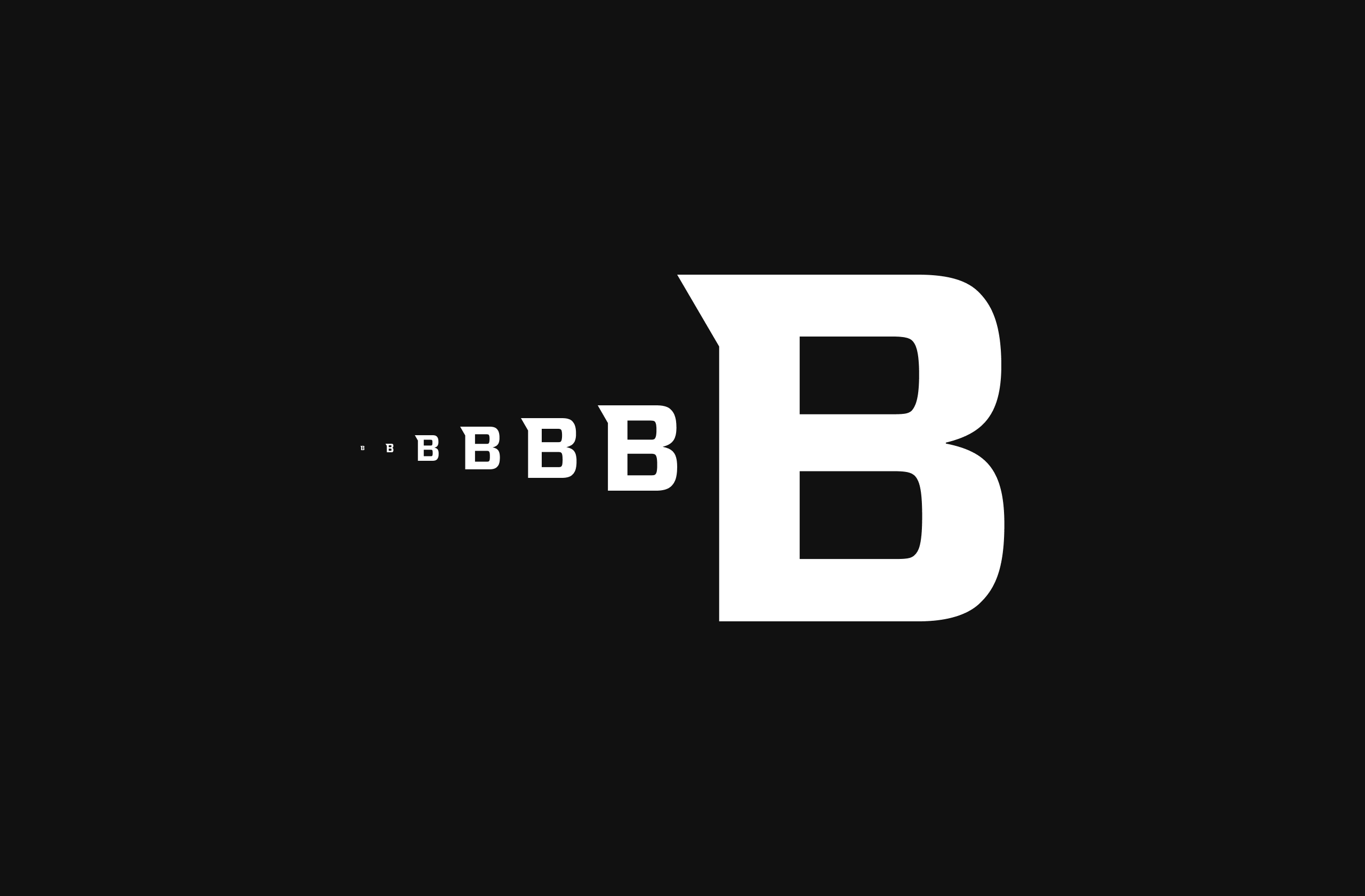
Small Size Customizations
Part of the issue of customizing letterforms is that the customizations can disappear at smaller sizes. By having a projection, we can maintain a visual prominence that isn’t lost as much when the logo is smaller.
The Ziggurat
The angled-yellow block serves as a “stamp” or seal. It cannot be understated the power of stamping on ownership. In fact, from the time of the Babylonians and ziggurats, cylinder seals were used to turn a general document into an “owned” communication from a monarch. Seals have existed in Medieval Europe, Qing China, the Ottoman Court, and on modern wedding invitations. This is our take. By utilizing the wingtip integrated into the ziggurat form, the stamp can be the finishing touch to most designs.
Livery

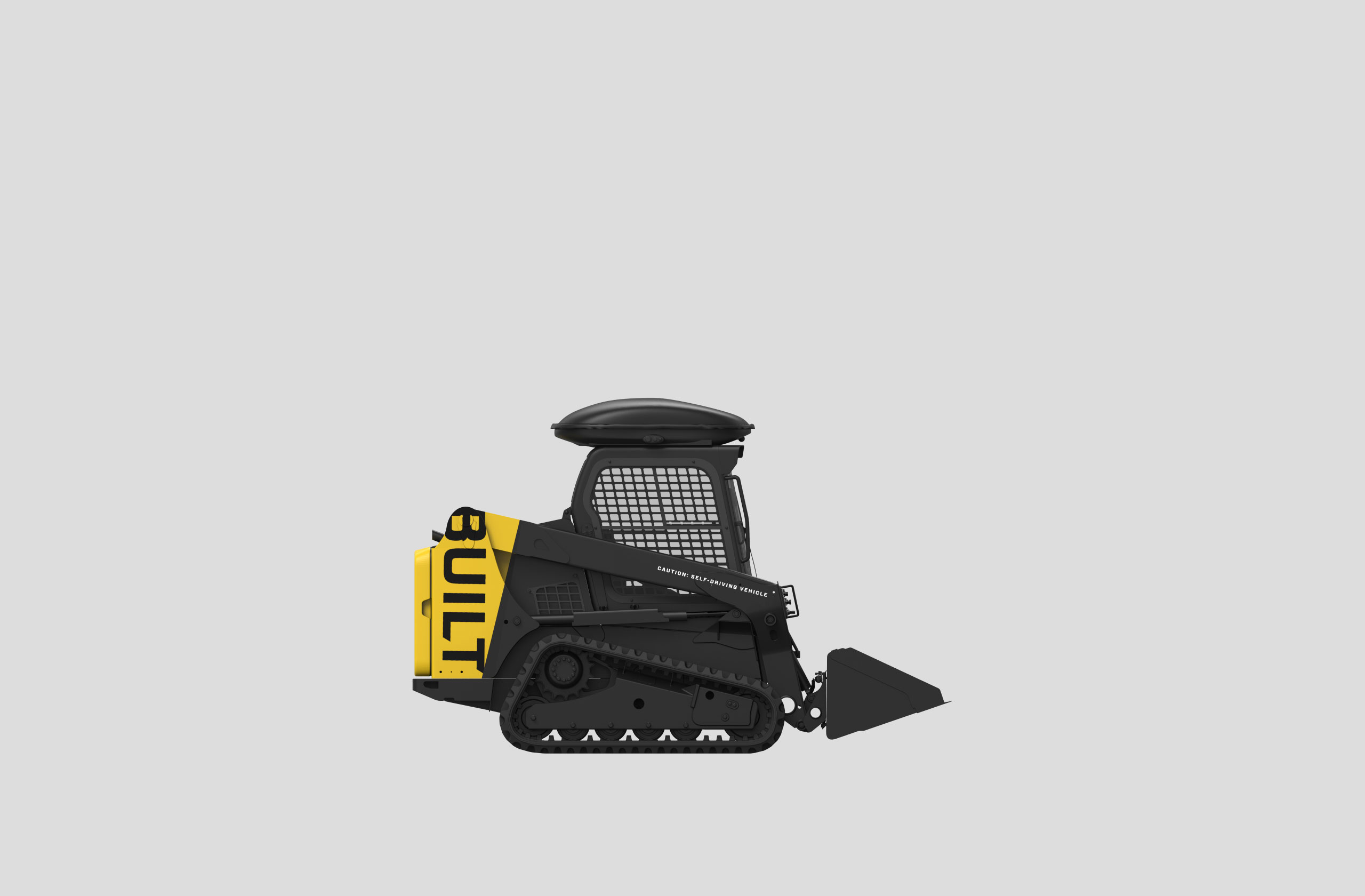
Hard goods and vehicles.
Designing for construction.
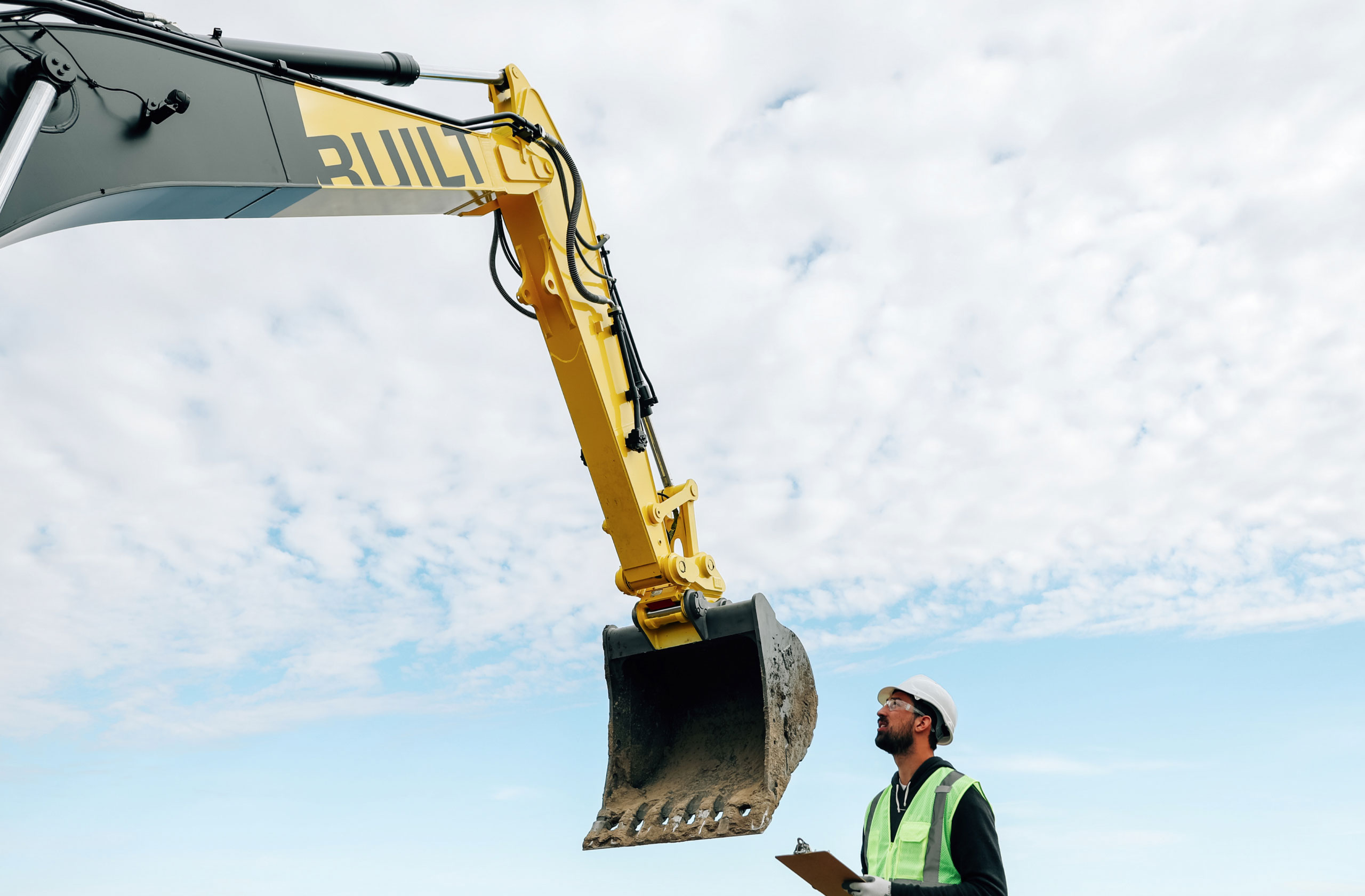
The flagship autonomous vehicle — ATL-74R — of Built Robotics needed to impress. We distilled classic construction hues but applied them in bold, contemporary dips of color. The effect is livery that is both familiar yet distinctly modern.
Marketing
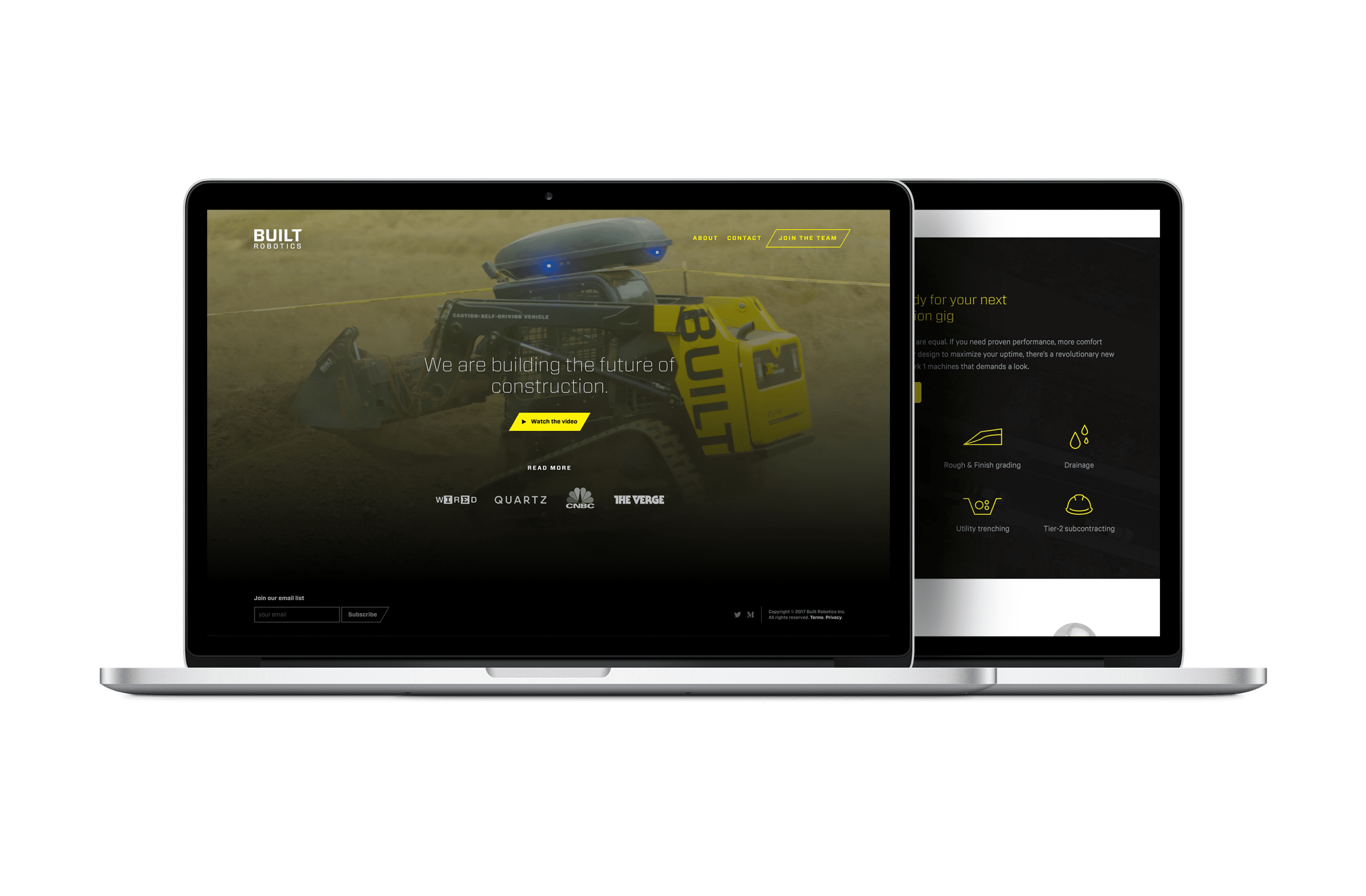

Web, video, and print.
Keeping the story bold.
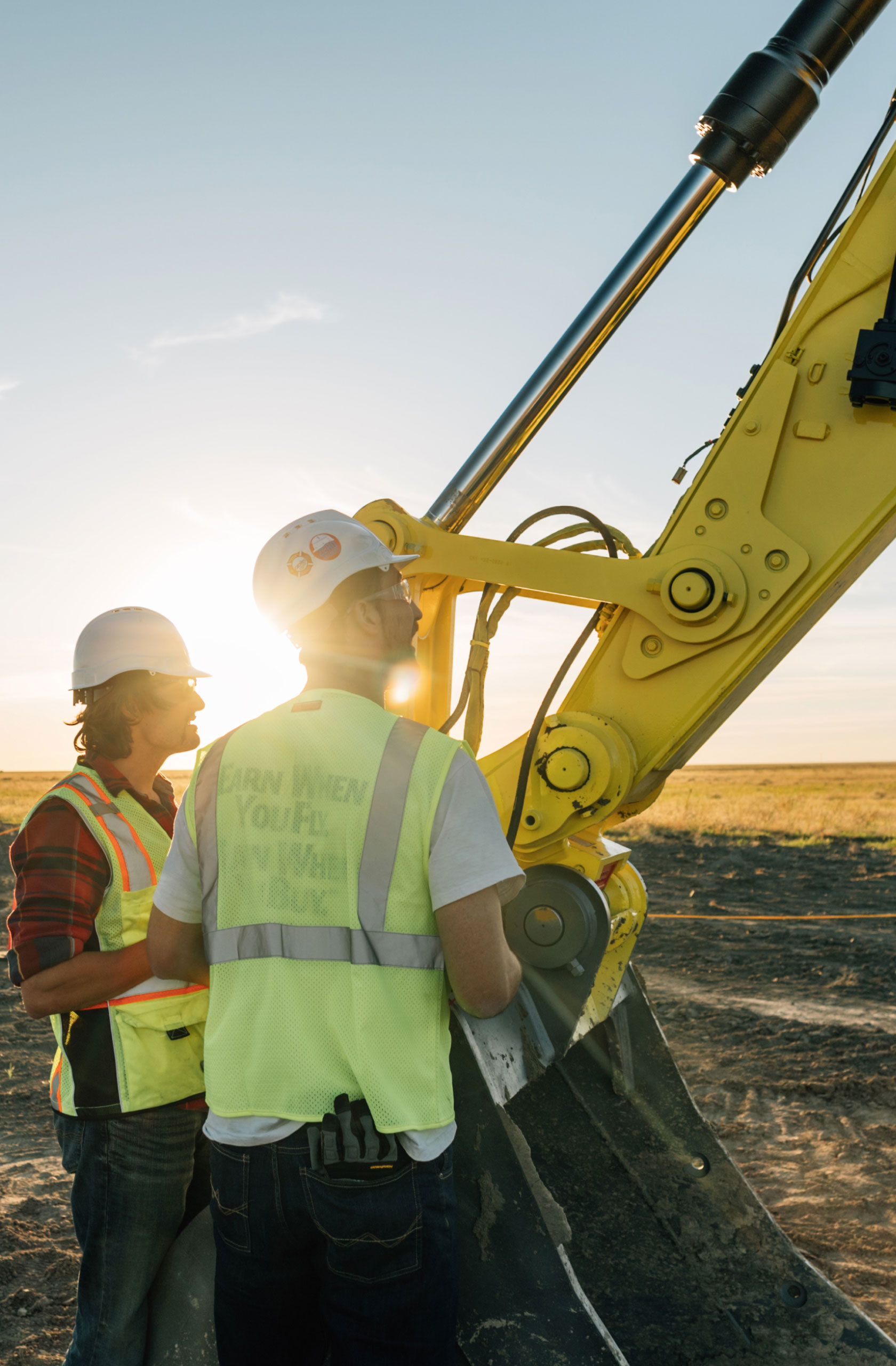
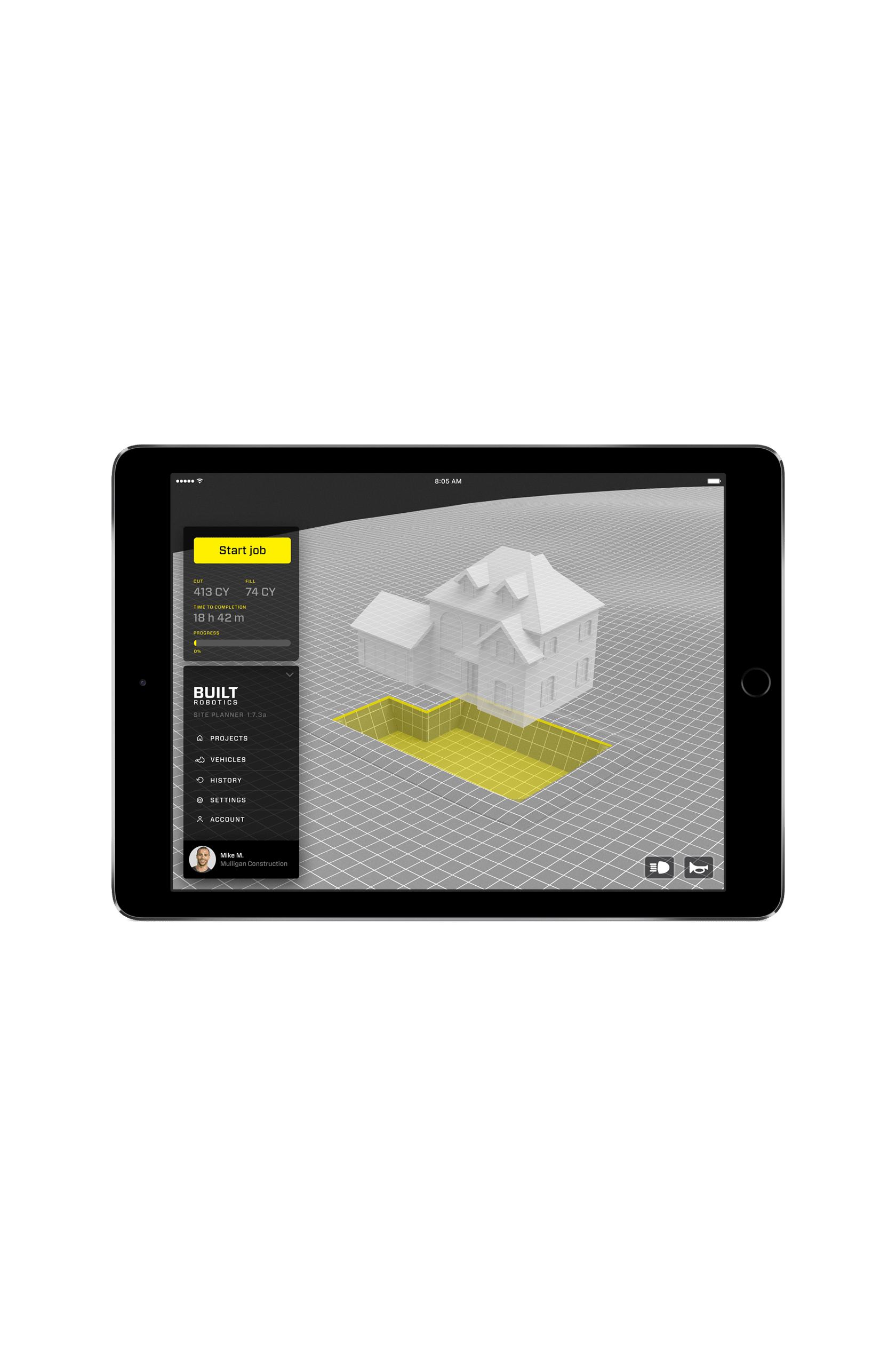
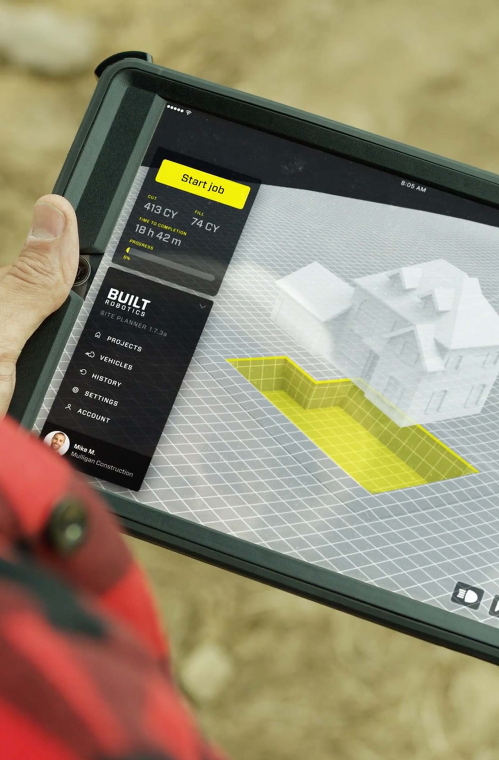
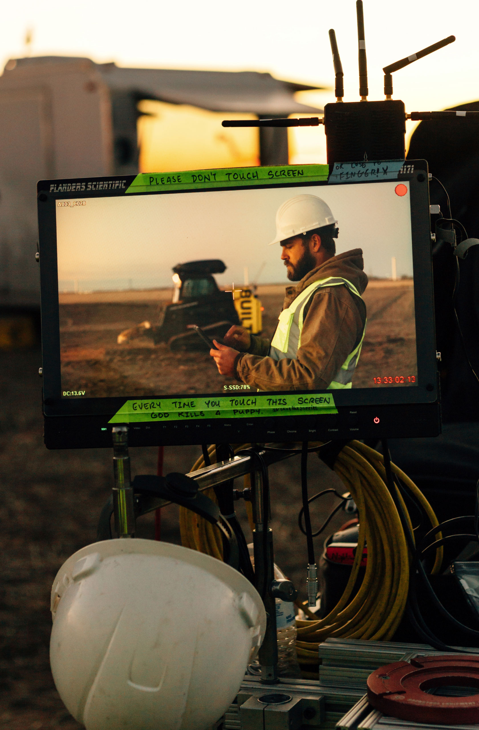
With a primary audience in construction, our marketing designs centered around bold design, impactful storytelling, and direct copywriting. I worked closely with the video team and CAD designer to develop on-screen graphics of the user interface for use in commercial videos. Custom photography echoed the forward branding with saturated effects and clear angles. All the elements came together to create a direct and clear brand to speak to a new generation of construction equipment.
Photography

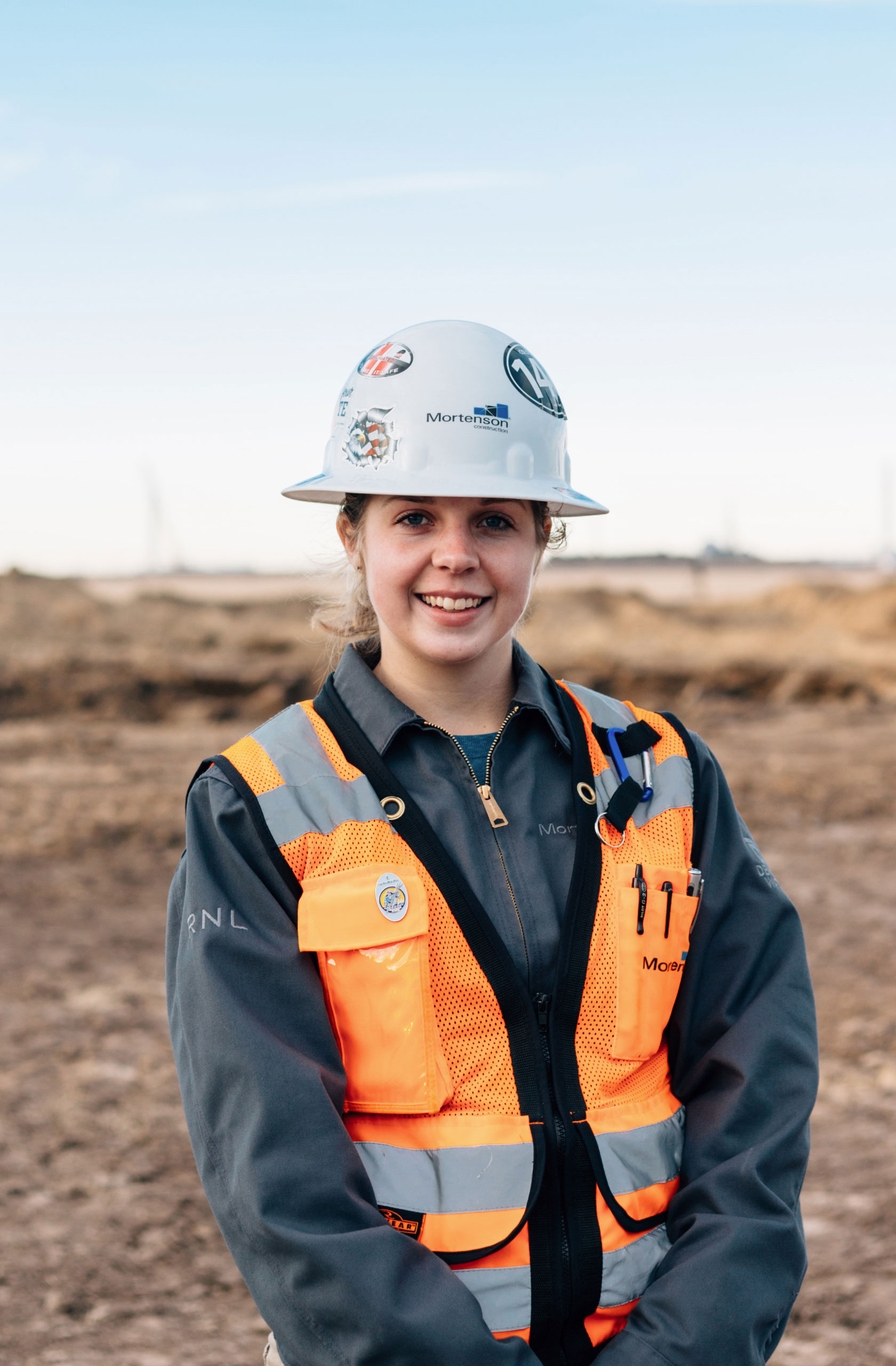
Environmental photography.
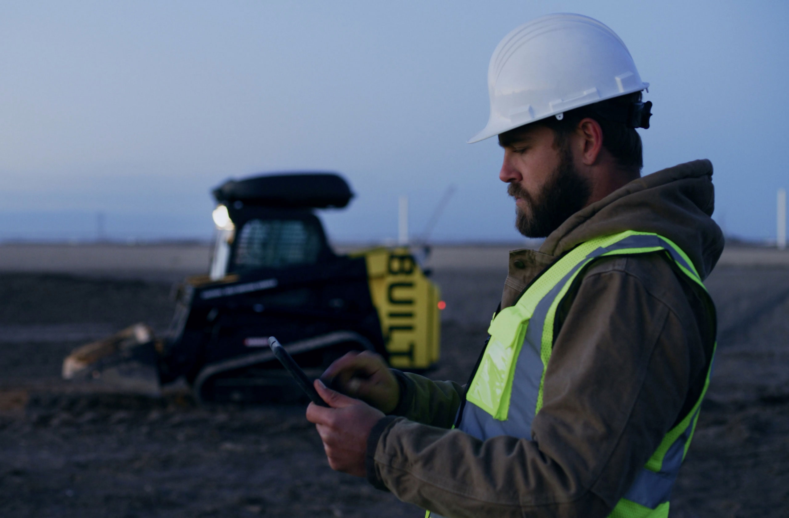
Showing the vehicle in the real world.
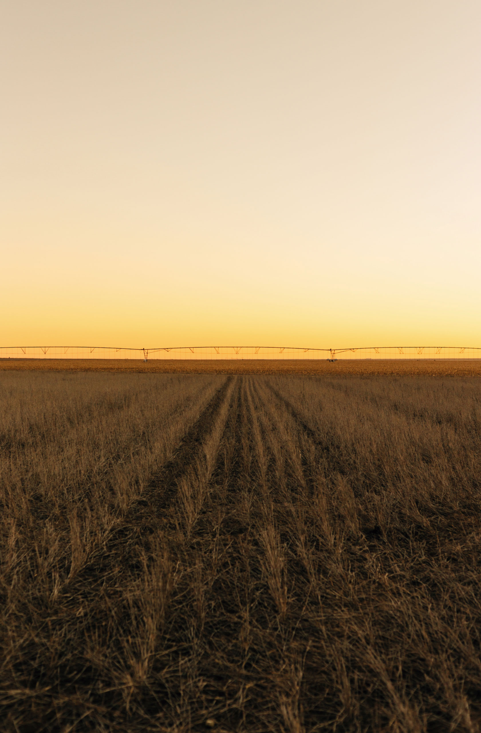
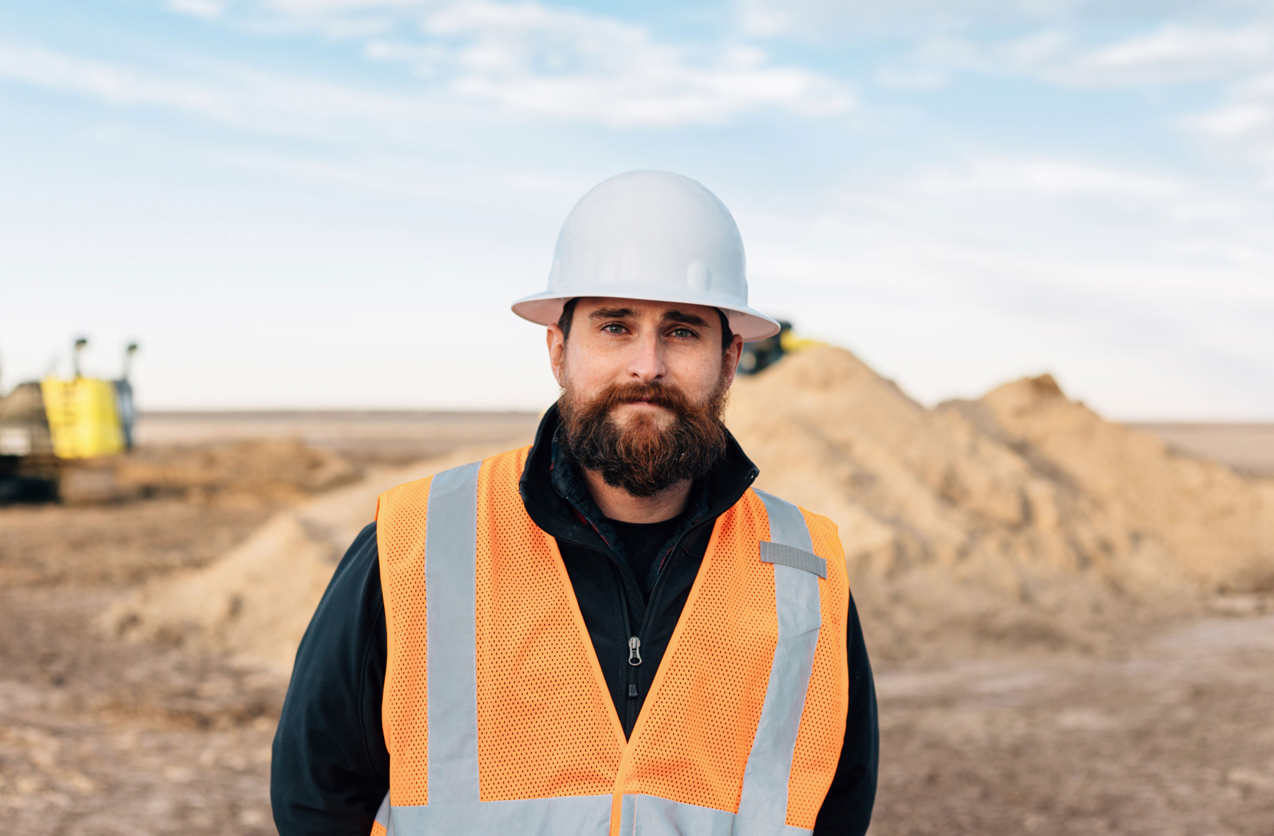
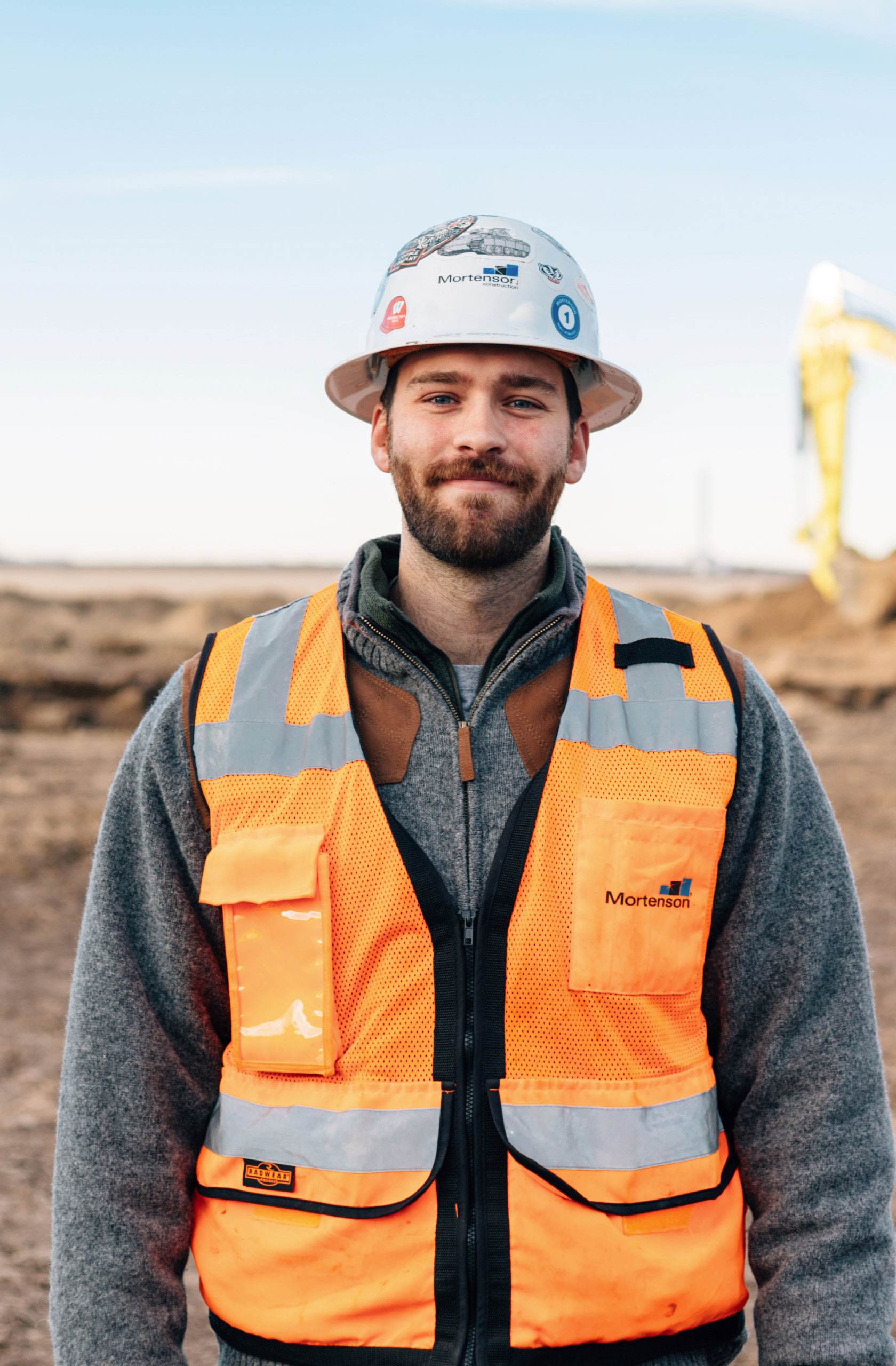
Realism is important for new technologies because they often require leaps of the mind: is this product real? Photography plays a role in creating the storytelling and physicality of the machine. We shot photos at real job sites using real machines: no rendering necessary.